


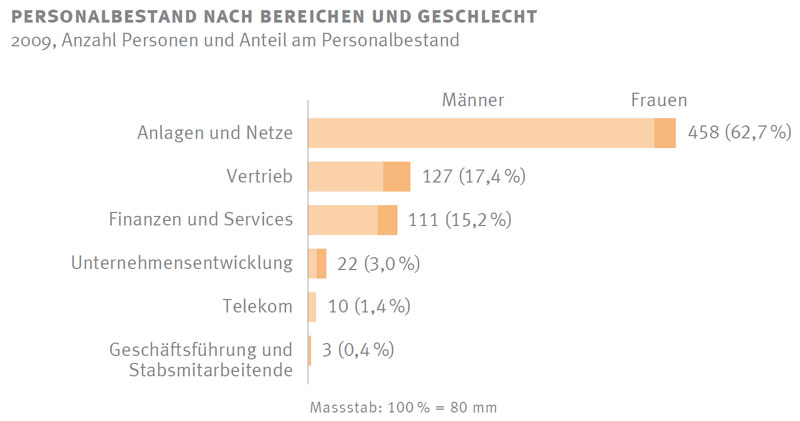
This bar visualization already shows two dimensions, which could hardly be displayed with a pie chart. The clear title concept and omission of legends are both very nice. What could be better? Perhaps omitting the percentage values or at least place them together on the lower right (in a table). They are somewhat distracting in this visualization. A rather vivid orange was selected for the figures of the current year – it looks quite nice, but is, in my opinion, not as suitable as our concept of using gray for the previous year and black for the current year. Why? Because orange is reserved for other purposes… (RH)