
Grozdanka Ivanovska
Grozdanka Ivanovska, a Bachelor Engineer in Informatics with 15+ years of experience, specializes in management reporting using IBCS standards, supporting clients throughout the full reporting lifecycle and training controllers to apply BI tools effectively.
About
Grozdanka Ivanovska is a Bachelor Engineer in Informatics with over 15 years of experience in software development and business analysis across industries such as supply chain and global mobility. She has spent the past decade specializing in management reporting, transforming data into actionable insights for decision-makers. At Vorteks ED, she supports local and international clients through the full reporting lifecycle – from data modeling to user support – applying IBCS standards to bring clarity and consistency to business communication. She holds a diploma from the Controller Akademie, and in addition to consulting, she trains controllers to apply BI tools effectively in day-to-day business.
Grozdanka’s focus:
- To help controllers and analysts design IBCS®-compliant dashboards that improve communication and efficiency.
- To support business users in understanding and using data for better decision-making.
- To strengthen the role of controlling through modern BI tools, structured reporting, and hands-on training.

IBCS® Certified Consultant
Grozdanka Ivanovska has successfully completed the IBCS® certification for successful design of reports and presentations at the IBCS Institute in August 2025.
Introductory to the gallery
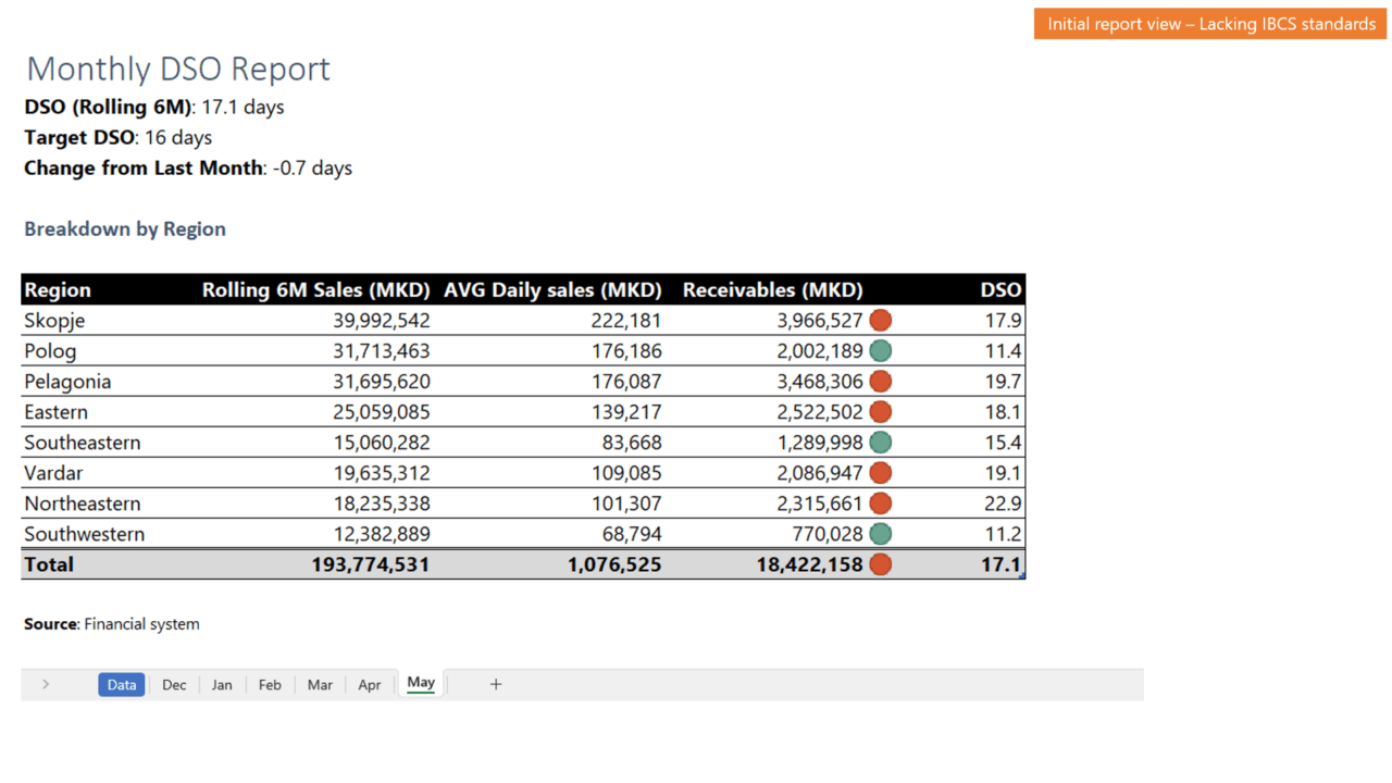
This work sample demonstrates the step-by-step transformation of a traditional Excel-based DSO report into an actionable, IBCS-compliant report. Using dummy data and designed entirely in PowerPoint, the sequence walks through identifying deficiencies, restructuring the layout, and applying clear visuals and messaging – turning raw numbers into meaningful business insights.
-
Slide 1 The first slide shows the traditional Excel-based DSO report. It stores each month’s data for a rolling six-month period on a separate sheet. This format makes it difficult to see trends, compare performance, or derive actionable insights.
-
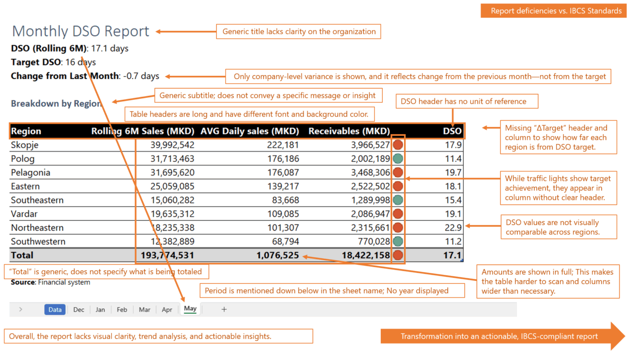
Slide 2 The second slide shows the identified deficiencies of the existing report against the IBCS standard, exposing gaps in structure, clarity, and visual effectiveness.
-
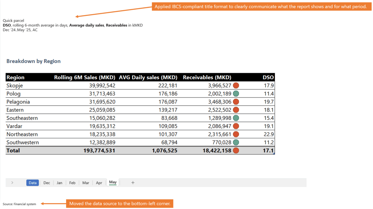
Slide 3 The transformation starts by applying an IBCS-compliant title format to clearly state the report’s content and period. The data source is moved to the bottom-left corner for consistency.
-
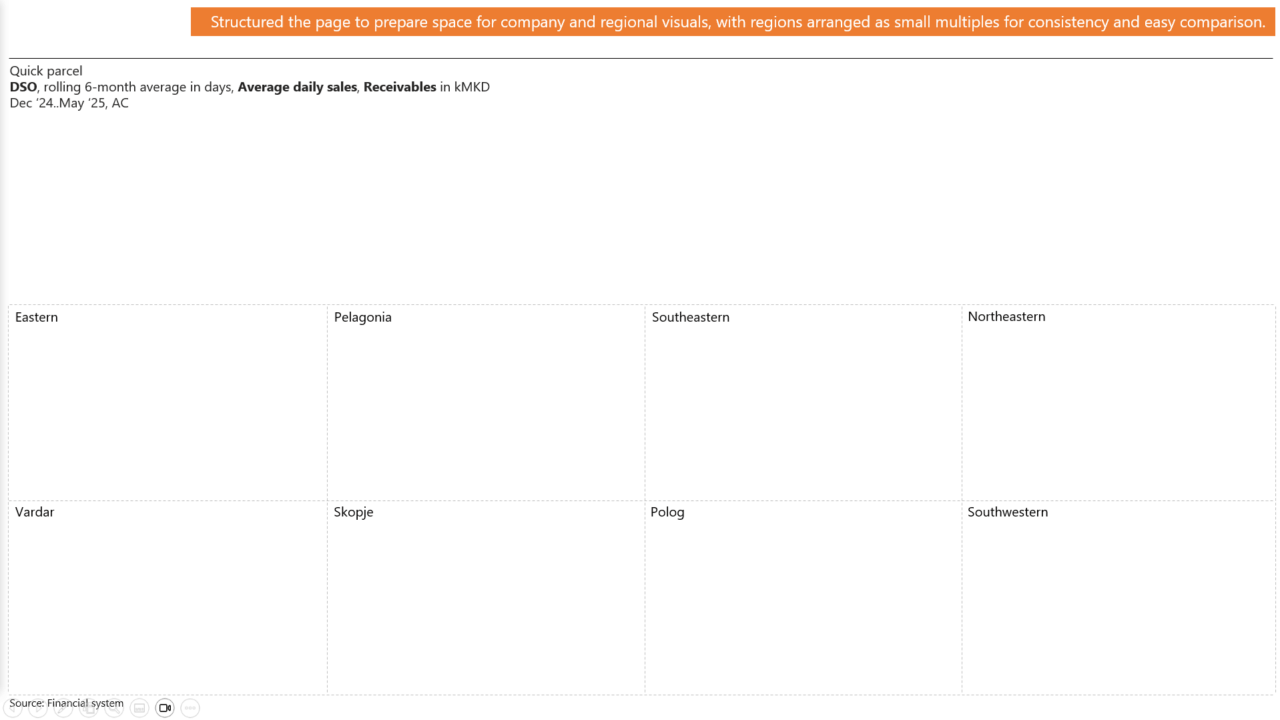
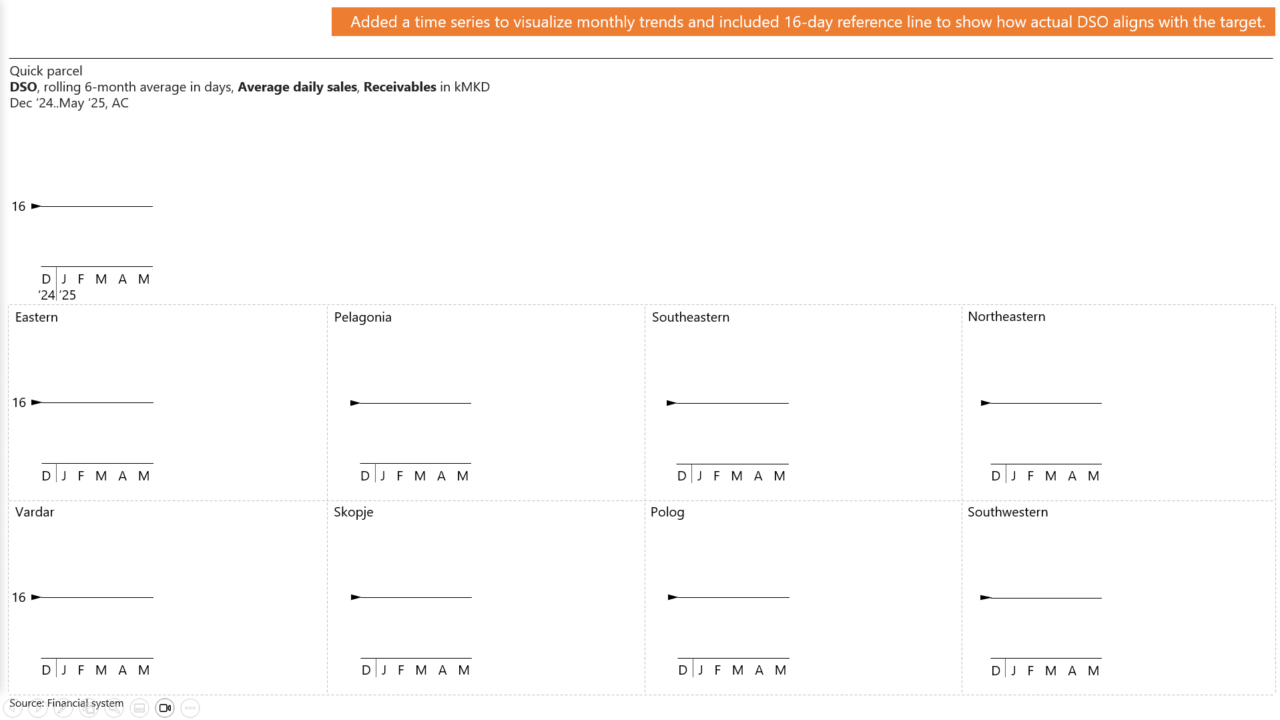
Slide 4 In this step, the original table is removed, and the page is structured by organizing the space for visuals of both the company and each region, with regional data arranged as small multiples to ensure consistency and easy comparison.
-
Slide 5 This step adds a time series to the visuals, allowing monthly trends to be clearly seen. A 16-day DSO target line is included as a reference, making it easy to compare actual performance against the goal and quickly spot deviations.
-
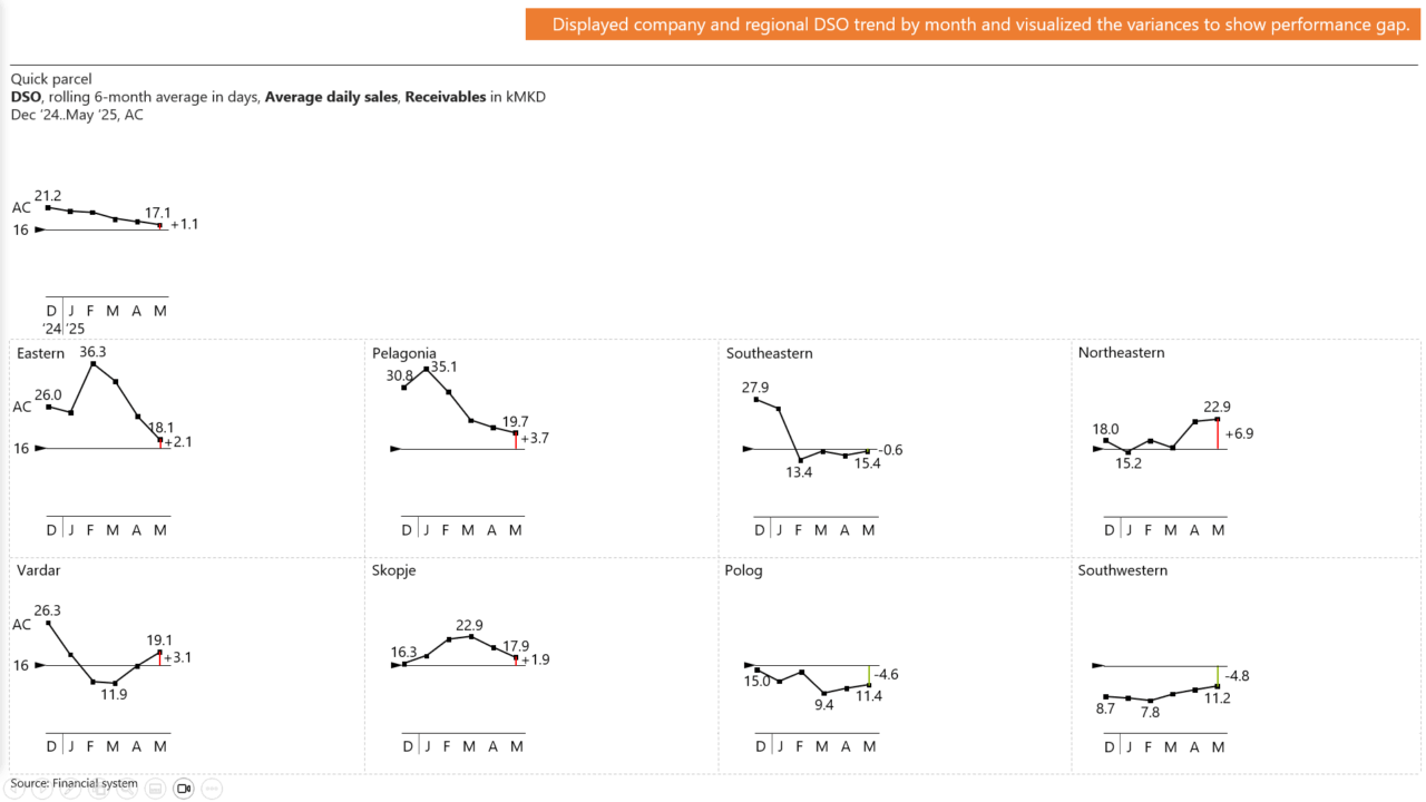
Slide 6 This step presents the actual monthly DSO trends for the company and each region. This enables quick identification of seasonality, performance patterns, and changes over time. Variances from the 16-day target are visualized directly in the charts, clearly highlighting performance gaps and drawing attention to areas that require action.
-
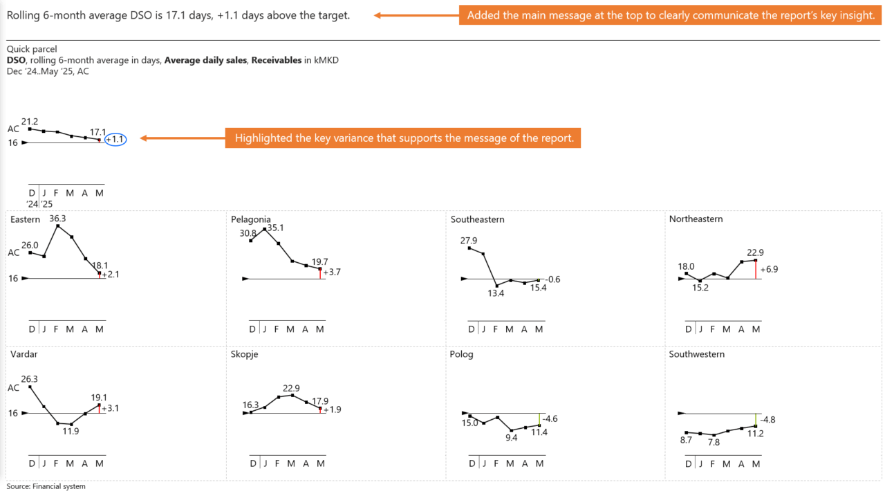
Slide 7 The main message is placed at the top of the report to immediately communicate the key insight to the audience. The variance that supports this message is highlighted within the company visual, ensuring that the most important finding is both clear and visually emphasized.
-
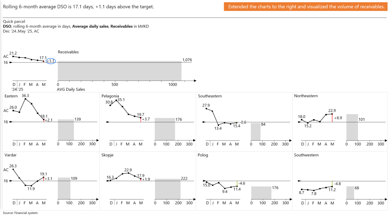
Slide 8 The charts are extended to the right to include a visual representation of receivables volume. AVG Daily Sales amount is added to support the interpretation of receivables volume and DSO. Receivables and AVG Daily Sales labels appear only on the company chart and are intentionally excluded on the small multiples to avoid clutter on the page.
-
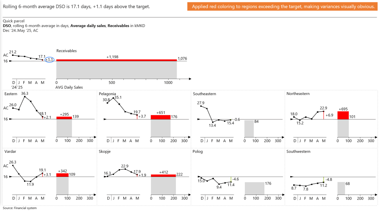
Slide 9 Red coloring is applied to regions exceeding the 16-day DSO target, making performance gaps immediately visible. The specific receivables excess amount is added for each highlighted region, turning the variance into an actionable figure that clearly shows how much should have been collected to meet the target.
-
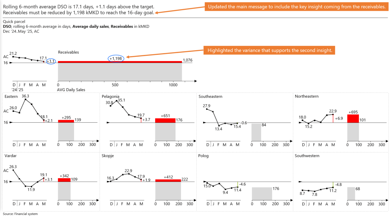
Slide 10 The main message is updated to include the key insight derived from the receivables analysis. The variance supporting this second insight is highlighted within the visual, ensuring the audience can quickly connect the data to the conclusion.
-
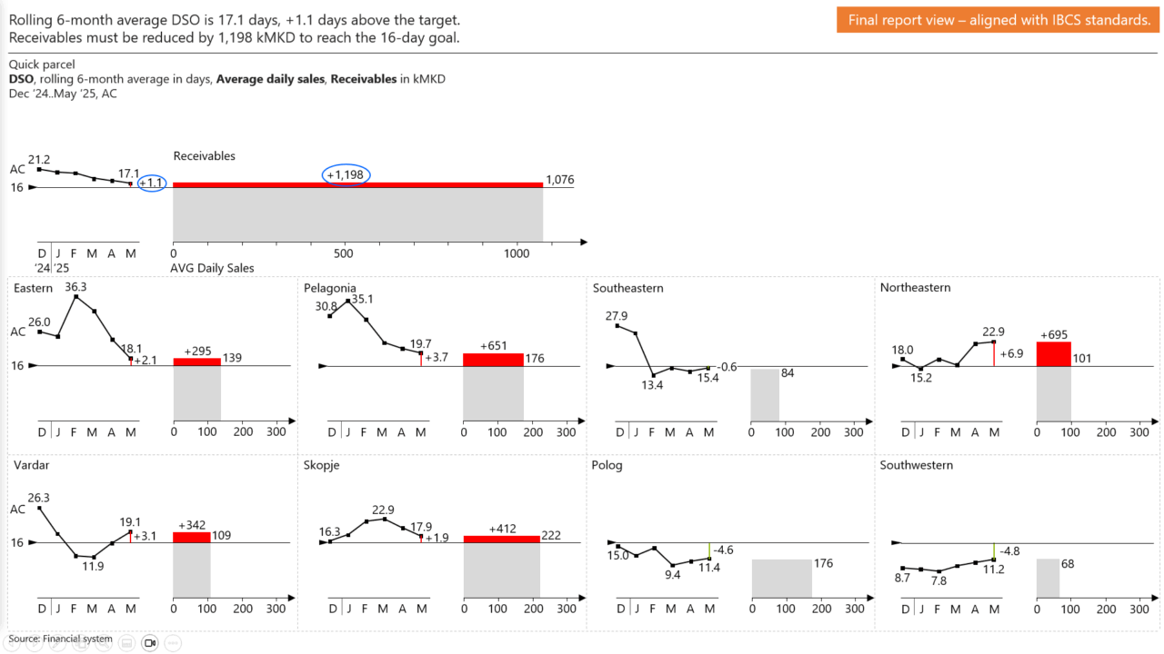
Slide 11 The transformation concludes with this final report view, fully aligned with the IBCS standard. The layout, visuals, and messages are structured to clearly communicate insights, enable easy comparisons, and support data-driven decision-making.

