
Marcin Ruta
The Founder and Data Analyst at Sonus IT Solutions, leading strategic data-driven solutions that empower businesses to make smarter decisions.
About
Marcin is a data enthusiast who helps companies unlock the full potential of their data. As the founder of Sonus IT Solutions, he believes that when data is properly prepared and analyzed wisely, it becomes a powerful resource that drives smarter decisions and sustainable growth.
Passionate about transforming complexity into clarity, Marcin empowers organizations to take control of their processes and data, turning raw information into actionable insights. His mission is to bridge the gap between technology and business strategy, ensuring that companies not only collect data but truly understand it and use it to gain a competitive edge.

IBCS® Certified Consultant
Marcin Ruta has successfully completed the IBCS® certification for successful design of reports and presentations at the IBCS Institute in March 2025.
Work Sample 1
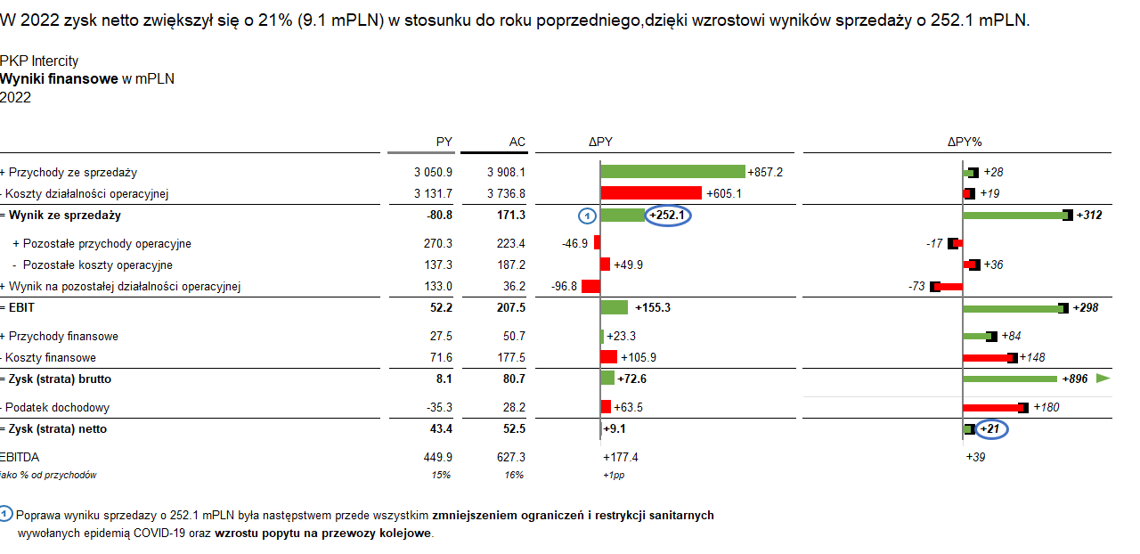
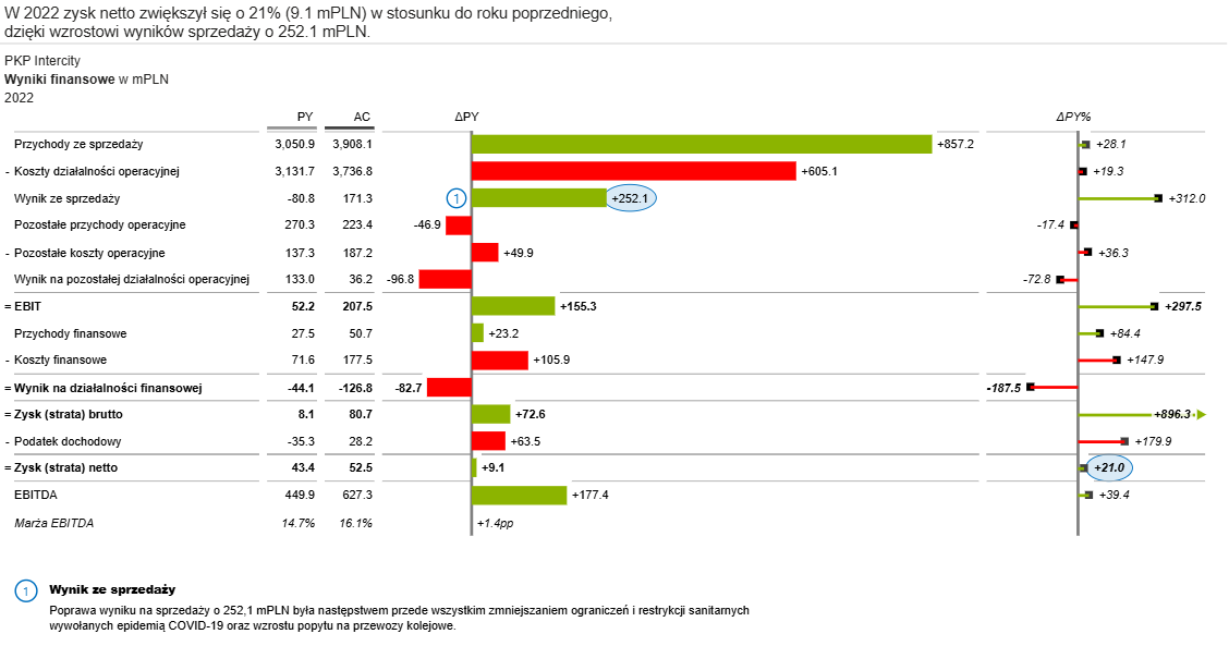
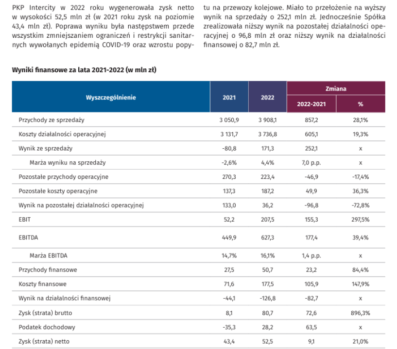
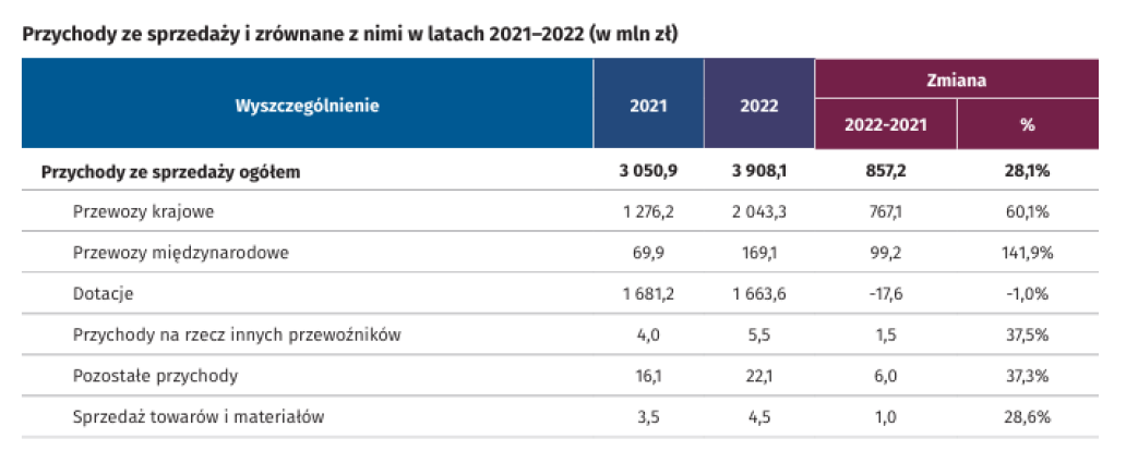
In the initial version of financial results, all elements were presented at the same hierarchical level, which made it difficult to see their relationships. The adapted one organizes them into clear groups with a structured hierarchy, enhancing readability and interpretation.
-
After Implemented in Excel
-
After Implemented in PowerBI with ZebraBI
-
Before
-
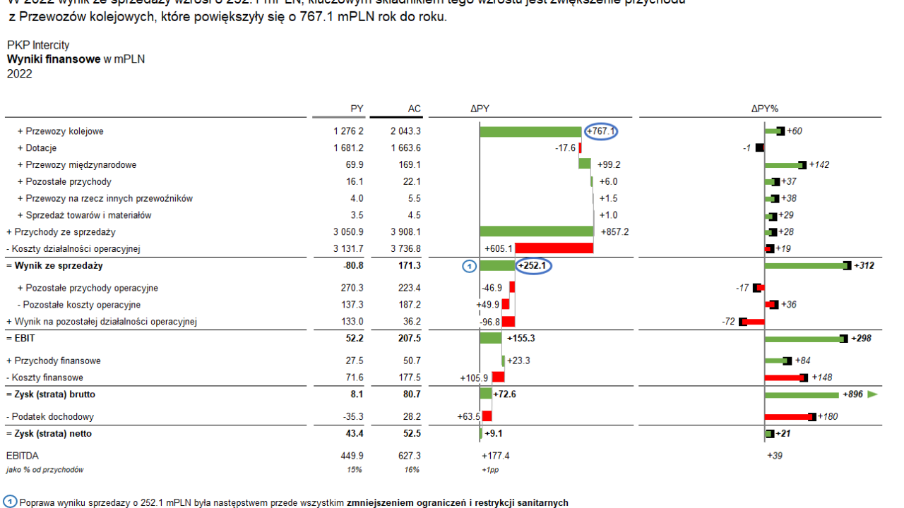
After Implemented in Excel
-
Before An addition to the previous visualization could be the condensation of sales revenue, illustrating the cause-and-effect chain leading to the financial result.
Work Sample 2
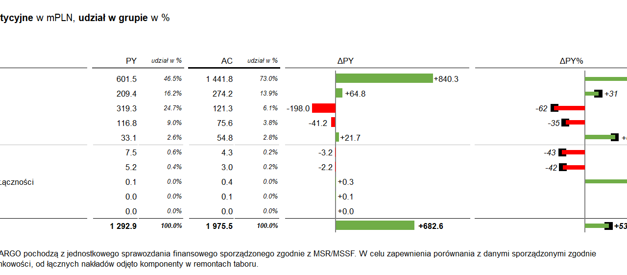
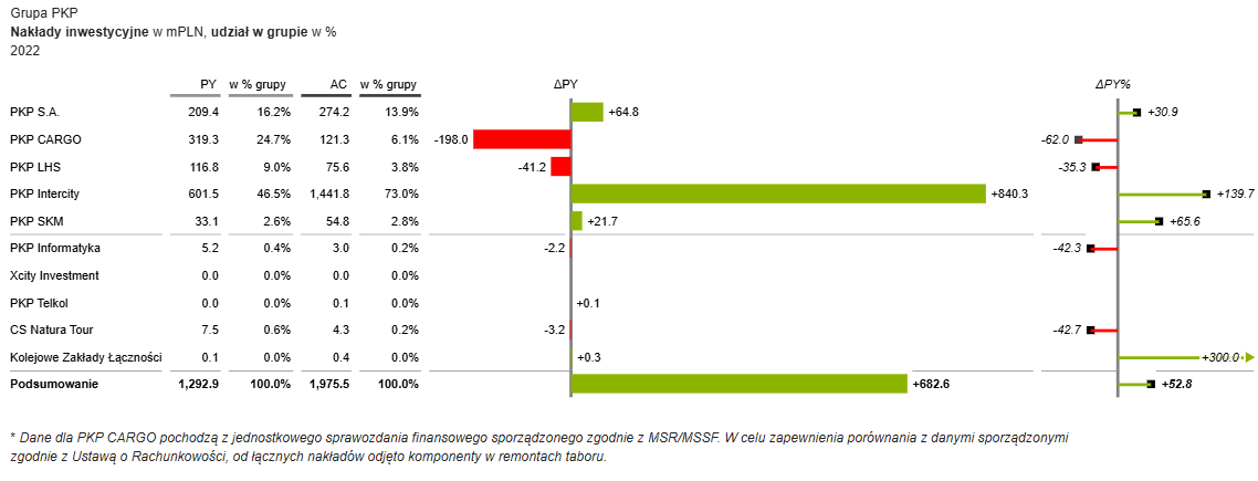
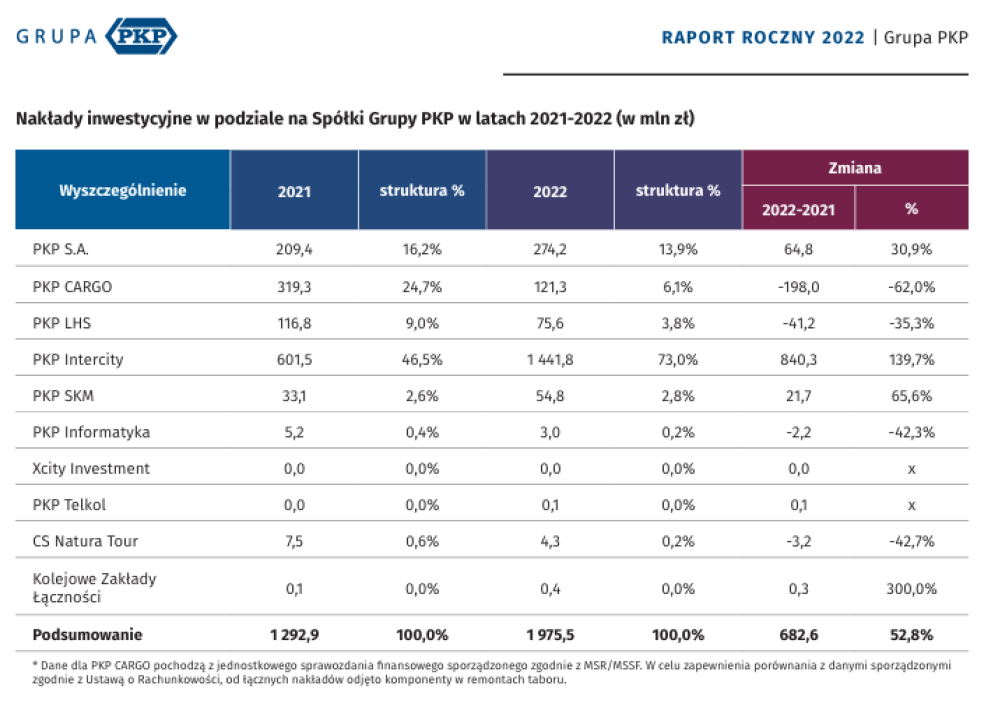
Although the table for investment expenditures is precise, it lacks the visual context that a combination of graphical elements can offer. A visual representation, such as a variance chart, allows readers to quickly grasp changes, which may not be as immediately visible in a table.
-
After Implemented in Excel
-
After Implemented in PowerBI with ZebraBI
-
Before
Work Sample 3
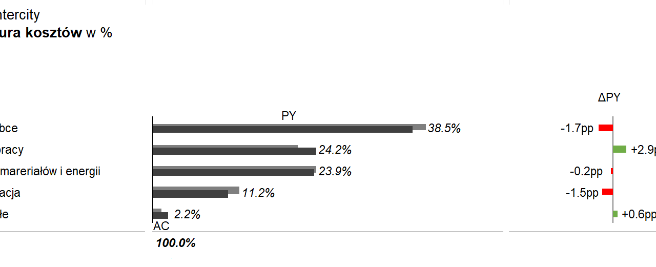
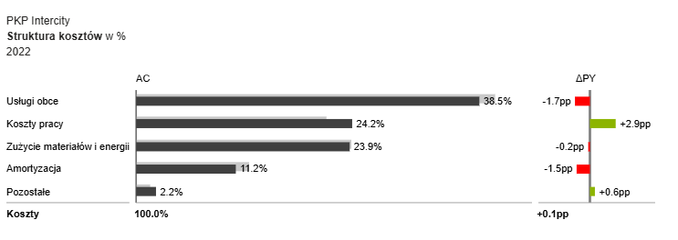
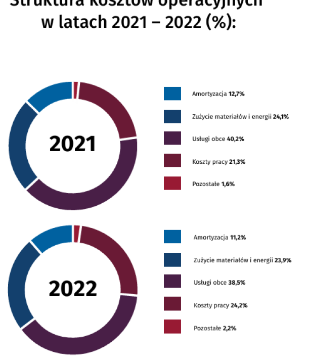
When examining PKP Intercity’s operating cost structure over a two-year period, clear visualization and easy comparison are essential. Therefore, selecting a percentage bar chart is an effective method to illustrate and compare cost distribution between periods.
-
After Implemented in Excel
-
After Implemented in PowerBI with ZebraBI
-
Before

