
International Business Communication Standards (IBCS®)
The International Business Communication Standards (IBCS®) are practical proposals for the conceptual and visual design of comprehensible reports and presentations. The IBCS® Standards are defined in a Creative Commons project hosted by HICHERT+FAISST and governed by the not-for-profit IBCS Association.
View IBCS® StandardsThe SUCCESS formula of the IBCS® Standards
The IBCS® Standards consist of seven rule sets forming the acronym SUCCESS:

Convey a message
Do you have something to report? Often reports are merely a collection of data with no discernible message for the audience. This is also the case for most presentations.
More about SAY
Apply semantic notation
Things which mean the same should look the same and things that are different should not look the same. Unambiguous design rules facilitate production and comprehension.
More about UNIFY
Increase information density
A high level of information density makes it possible to display complex facts. Only an overview of the entire picture permits correct evaluation of detailed information.
More about CONDENSE
Ensure visual integrity
The recipients of a report expect the data in it to be accurate. But are the correct data also presented accurately? Manipulated charts are a matter of fact in business communication.
More about CHECK
Choose proper visualization
Good visualization starts with the selection of those diagrams and tables, which convey the desired message along with the underlying facts as quickly as possible.
More about EXPRESS
Avoid clutter
SIMPLIFY facilitates the readability of charts and tables. Eliminating ‘Noise’ and ‘Redundancy’ frees objects in a report from avoidable background noise.
More about SIMPLIFY
Organize content
Reports and presentations have, in many cases, no logical structure. When things overlap and are incomplete, they make it hard to understand business communication.
More about STRUCTURETOP TEN topics of the IBCS® Standards
Consider the following TOP TEN topics of the IBCS® Standards to improve your reports and presentations:

-
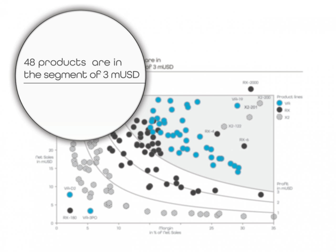
1 Messages Reports and presentations have messages. Present them at the top of each slide or report page.
-
2 Titles Titles identify pages, charts, and tables. Name at least organizational unit(s), measure(s), and time period(s).
-
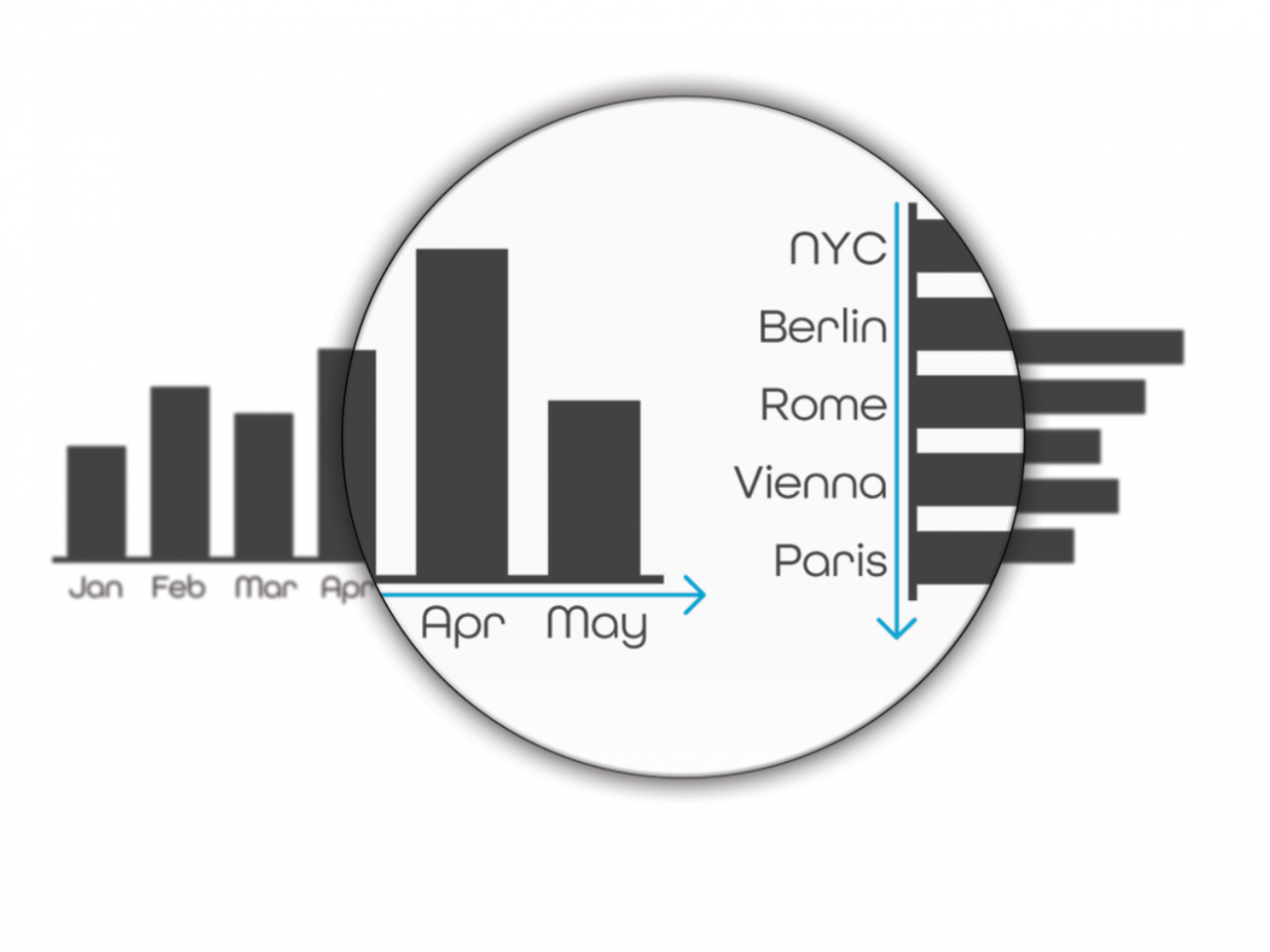
3 Time and structure Time and structure are the most important analysis types. Arrange time series horizontally and structural comparisons vertically.
-
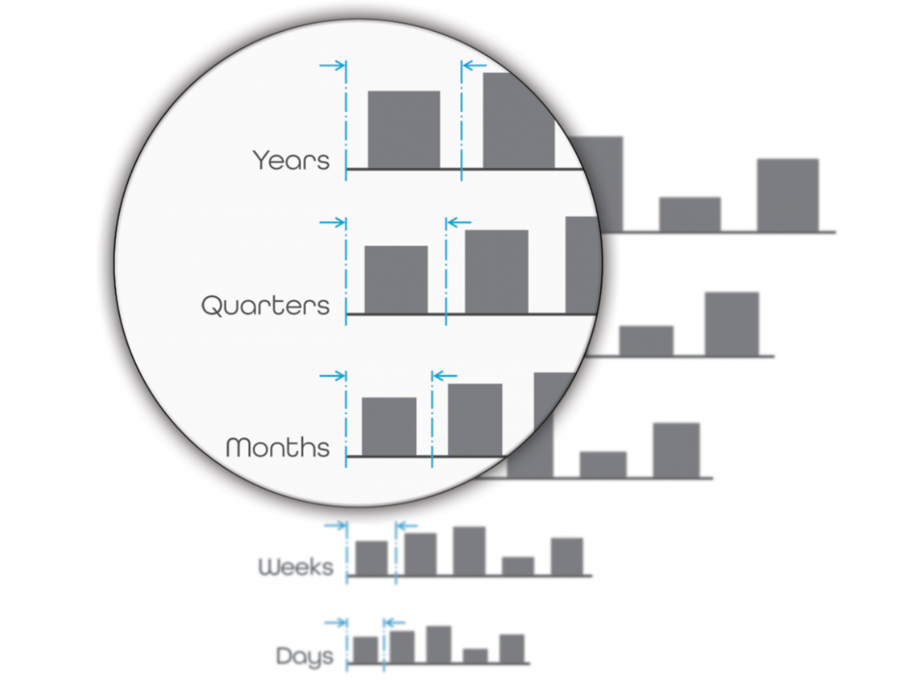
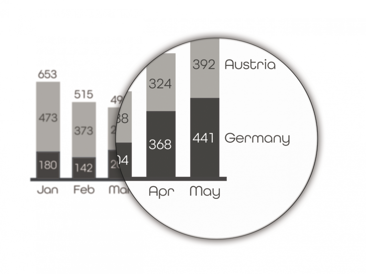
4 Time periods Time periods such as ‘Years’ and ‘Months’ should be identified by different category widths.
-
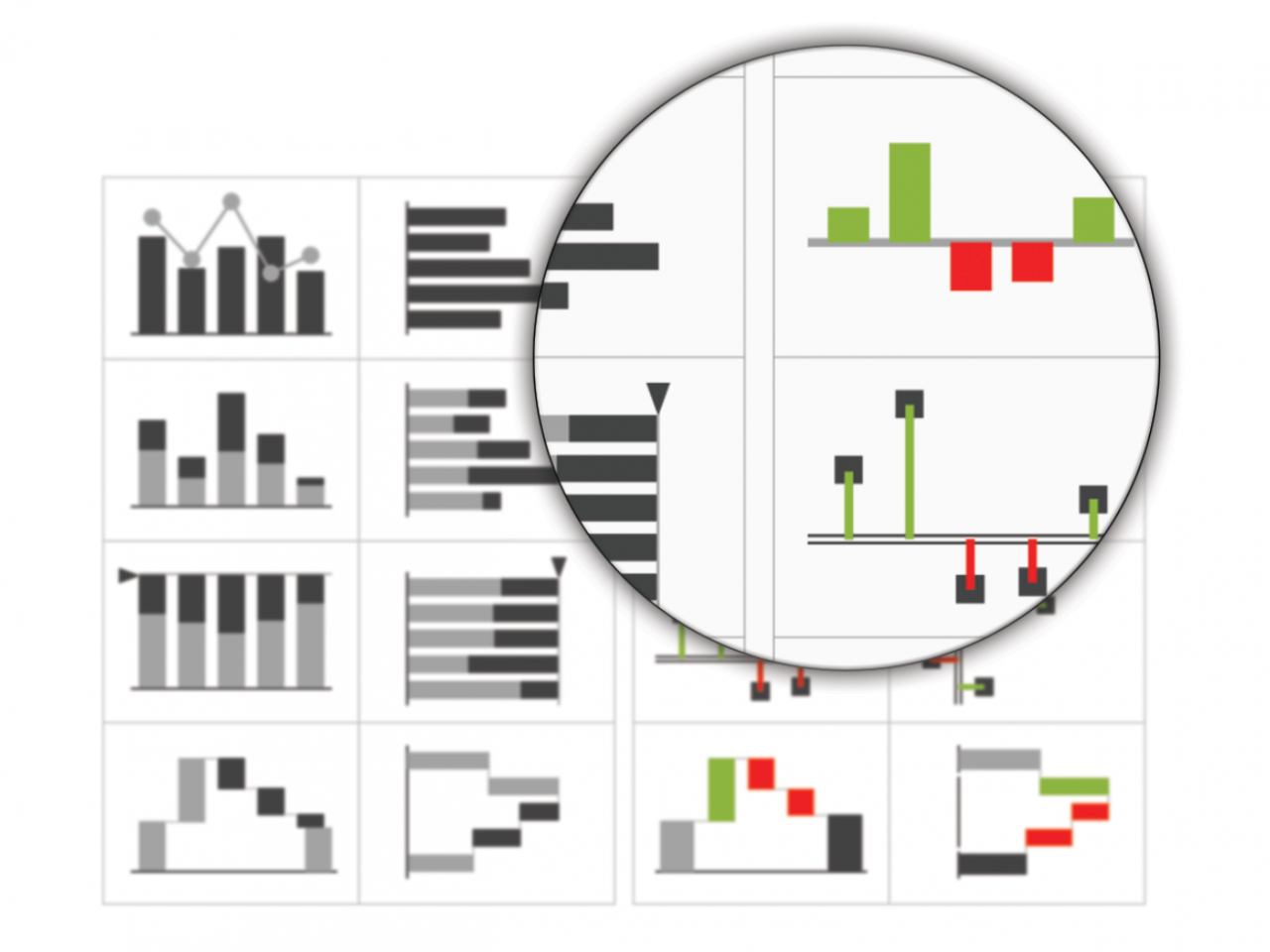
5 Charts Charts are key for perception. Prefer columns, bars, and lines to pies and gauges.
-
6 Labels Labels name data. Integrate labels for data series and values in charts. Try to avoid value axes and grid lines.
-
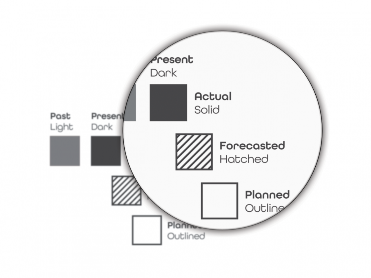
7 Scenarios Scenarios represent the data categories to be compared. Use standard notations for actual, planned, and forecasted data.
-
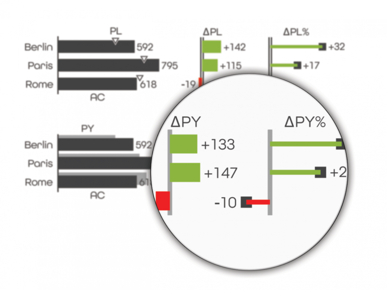
8 Variances Variances are differences between scenarios. Unify colors for good and bad variances. Use pins for relative variances.
-
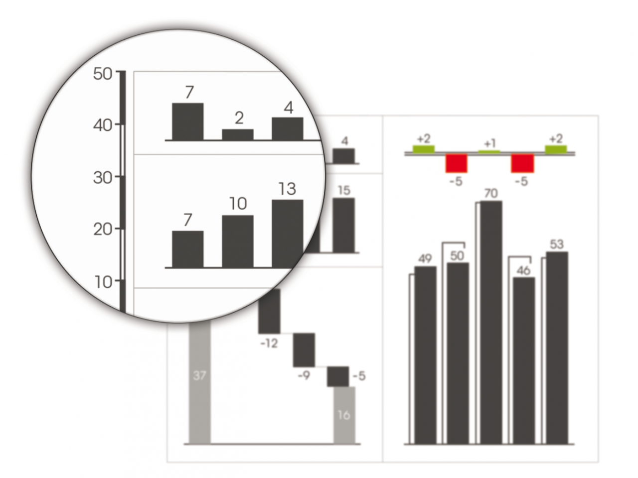
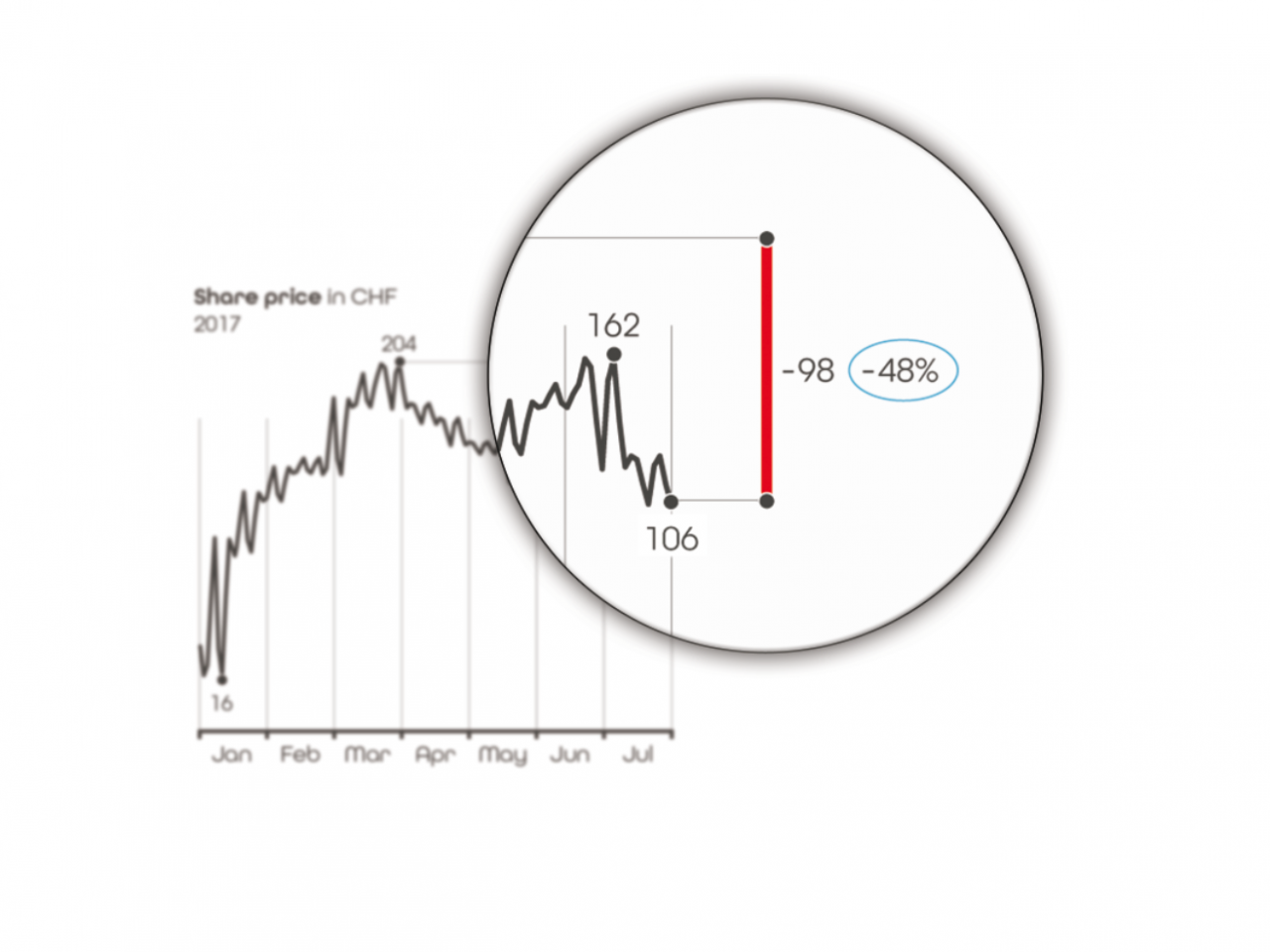
9 Scaling Comparisons require consistent scaling. Don’t cut axes. Use the same scale for the same units. Add scaling indicators if necessary.
-
10 Highlighting Highlighting accelerates comprehension. Use unified indicators such as ellipses, trend arrows, and difference markers.

