TRUECHART 2025.2.2
Enterprise-class IBCS visualization and collaboration for Qlik and Power BI.
About
TRUECHART empowers people to understand their business and collaborate to their potential. TRUECHART is a scalable, enterprise-class standardized visualization solution that integrates with your preferred BI and Analytics tools (Qlik or Power BI) that enables the user to quickly and easily build IBCS-compliant reports. TRUECHART enables faster, better, more-informed decision-making across your entire organization by offering functionality to fully enable IBCS in any corporate environment as well as enabling Data point-specific real-time collaboration.
Powerful IBCS Charting Engine
TRUECHART allows users to harness the full benefits of the International Business Communication Standards (IBCS) and adds an advanced financial report notation system to your preferred BI and Analytics platform (Qlik or PowerBI). One license works across every integrated platform.
Advanced Chart Creation Wizard
TRUECHART allows report authors to quickly and easily build sophisticated IBCS®-compliant charts and graphs with a flexible, easy-to-use Wizard. IBCS-compliant reports can be created and deployed in minutes, providing information to report consumers more quickly, in an optimised responsive layout format that fully leverages the benefits of IBCS.
Report Annotation and Commenting System
TRUECHART adds cross-platform “smart commenting” to your reporting and analytics processes, allowing stakeholders to add comments, explanations and key messages to any chart, graph, report, or key figure. These annotations are centrally stored, linked to key values, and dynamically available for display across all relevant reports, systems, and platforms so your key messages and explanations are available anytime, anywhere.
Data Point Specific real-time Collaboration
KPI-CHAT enables knowledge workers to communicate where insights are valued most, inside reports and dashboards, enriching analytical results and delivering actionable insights. As simple as mainstream chatting applications use, but sophisticated enough to enable the user to chat within the BI Application, on a specific data point.
MENUBAR
MENUBAR complements Qlik Sense and Qlik Cloud and adds customizable navigation elements. It allows for vertical and horizontal buttons and selections (fields, drill-down dimensions, master dimensions and variables) as well as unlimited trigger-based actions. In addition, you can share apps with the current selection with a single click, as well as conveniently chain documents including current or changed selections to navigate between apps.
For more information about the benefits of TRUECHART, customer testimonials, and our partner program for IBCS® Certified Consultants, Trainers and Providers, visit www.truechart.com.
IBCS® Certified Charts+Tables
TRUECHART 2024.3.0 has successfully passed the examination in accordance with the provisions of the IBCS® software re-certification process in January 2025. TRUECHART initially was certified in July 2016. The visual design of the presented business charts and tables is certified to be compliant with the Standards proposed by the IBCS Association.
Examples
Here are some examples of IBCS® compliant reports, such as the templates which have been developed by HICO-Group during the certification procedure.
-
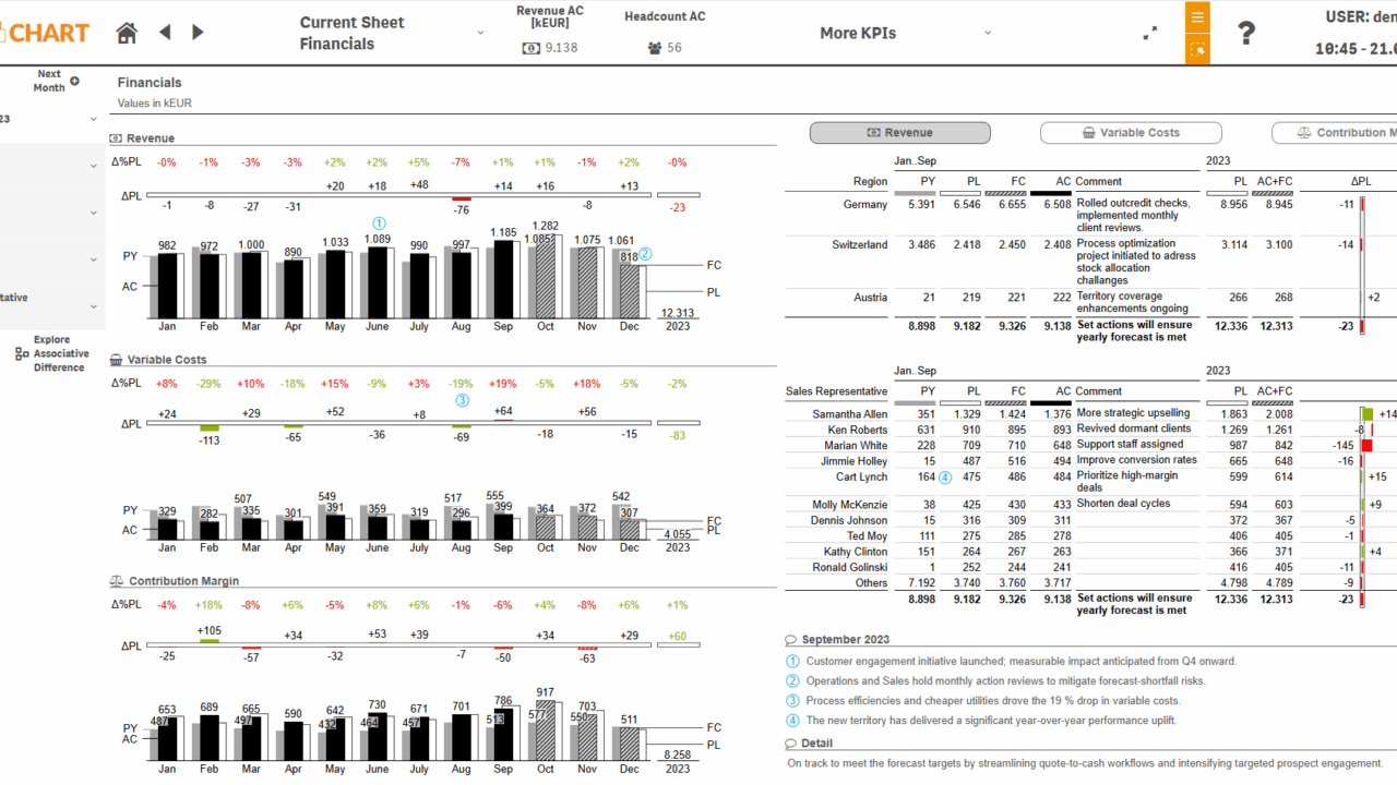
Contribution Margin & Its Drivers at a Glance This TRUECHART finance dashboard visualizes the monthly development of contribution margin–related finance KPIs, with a clear focus on presenting variances in an easy-to-read, correctly scaled format. Individual KPIs can be selected for deeper analysis, while the integrated commenting feature enhances the analytical process by adding meaningful business context to the results.
-
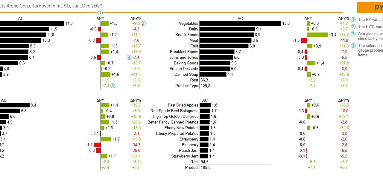
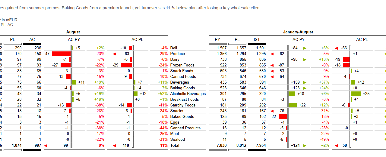
Product Basket Performance This TRUECHART Basket Analysis shows sales in relation to the Product hierarchy and highlights change versus the previous period. Using IBCS principles such as uniform scales, consistent notation, and green/red variance bars makes comparisons quick and reliable across all charts. Users can select any category to drill down, while on-chart comments add business context to wins and issues.
-
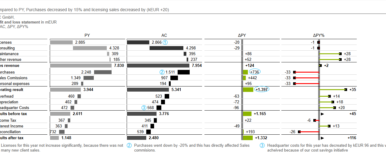
Profit and Loss Variance Analysis This chat breaks down year-over-year P&L performance, using a waterfall to show the structure of results and dedicated charts to pinpoint the magnitude of key variances. Semantic colours instantly clarify if a past year variance is favorable or unfavourable, while integrated comments explain the underlying business drivers, transforming complex data into a clear and actionable story.
-
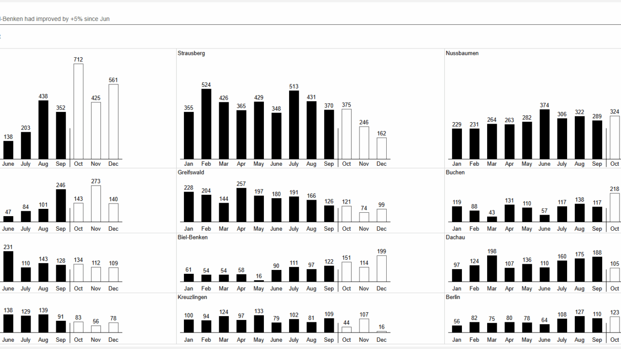
A Comparative Sales Analysis This report uses small multiples to compare sales performance across all cities in a single, unified view. The concise side-by-side layout makes it effortless to spot crucial trends and outliers, transforming complex data into a clear strategic story of which markets are thriving and where to focus attention.
-
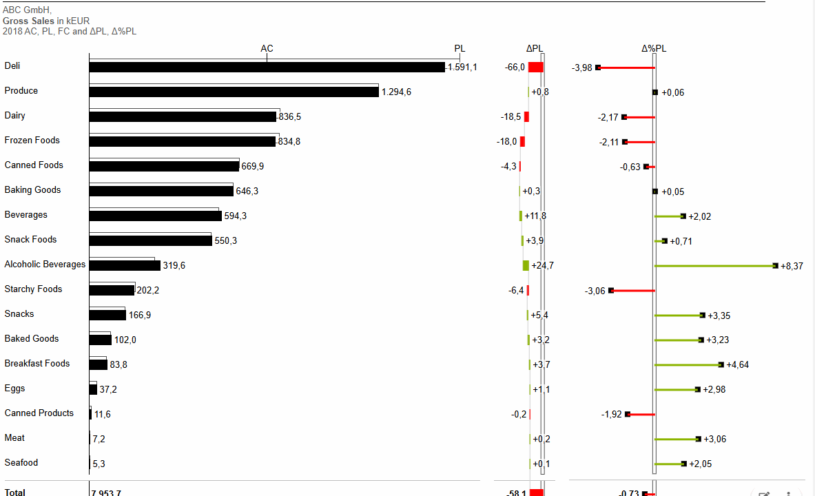
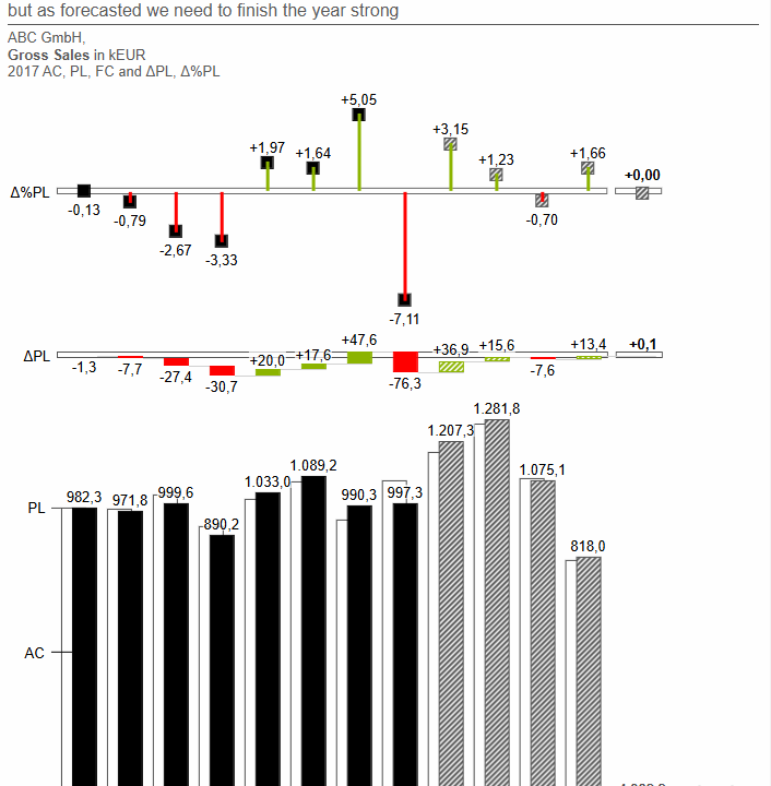
Pinpointing Performance Gaps Effective tracking gross sales by using a structure with variance analysis. By separating absolute and relative variances into their own correctly scaled charts, it avoids distortion and provides an unambiguous view of what's driving the total deviation from plan.
-
A multi scenario view of monthly Sales performance Gross sales visualised in a smart multi tier time-series analysis. The standardized notation, solid for Actuals, outlined for Plan, and hatched for Forecast, ensures instant comprehension, tracking both performance and forecast accuracy in one dense chart.
-
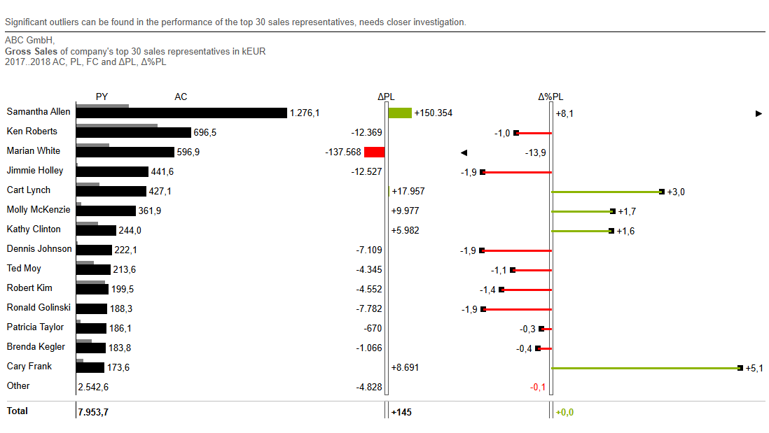
Sales Representative Performance Ranking the reps by actuals and providing clear variance charts enables immediate identification of top performers and outliers, turning data into a clear management tool. Initelligently removing the visual bar for the Others category supports the visual focus on what matters.
-
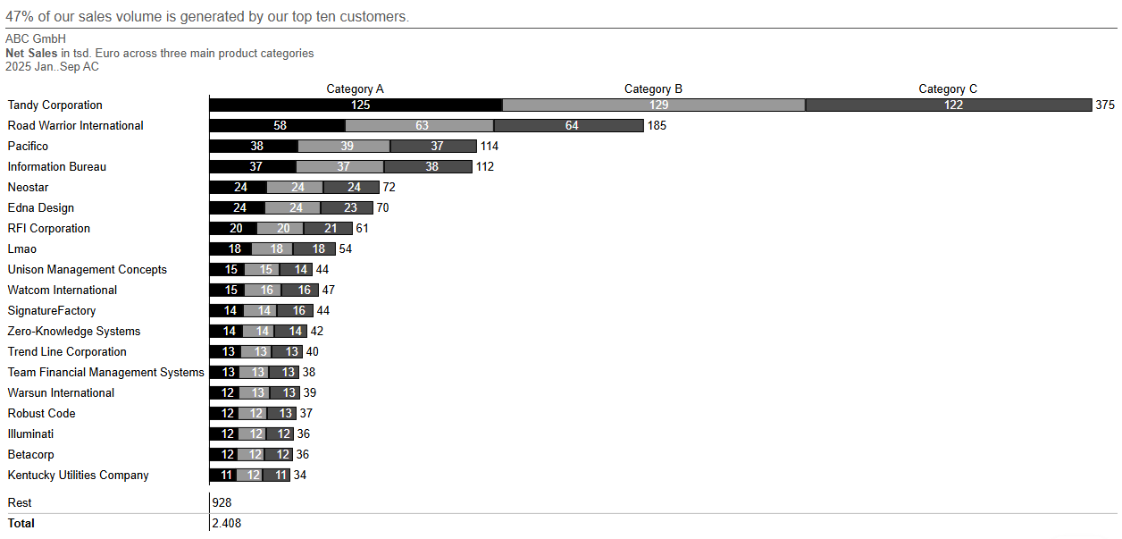
Understanding Your Customer Sales Mix The stacked bars brilliantly show two things at once: the ranking of top customers by total sales and the product mix for each one. It’s a dense, insightful view perfect for spotting cross-sell opportunities and customer concentration.
-
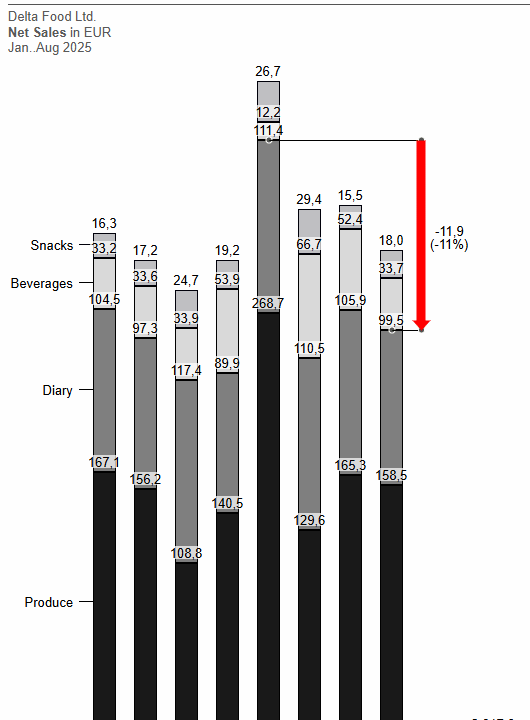
Tracking Sales Composition Over Time The correct choice for a time-series composition analysis. This format clearly displays the overall monthly sales trend while simultaneously revealing the shifting contribution of each product category, making it easy to spot emerging patterns and trends.
-
Combining Tabular Precision with Visual Clarity A prime example of the IBCS Condense principle, this report uses visual elements, standard notation and correct scaling within a table chart. This hybrid approach delivers numerical precision alongside the at-a-glance clarity of visuals, dramatically accelerating the process of spotting key YTD and Month variances.

