


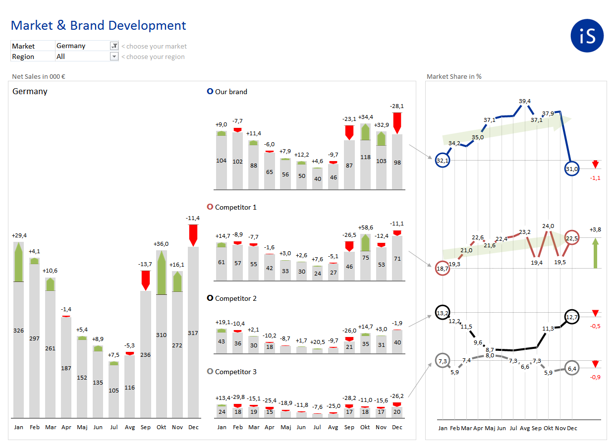
This is an exercise in scaling. All column charts are scaled, even though they have different heights. This allows the reader to directly compare the values, while the charts occupy the optimal amount of space on the report. The color-coded markers beside the brand names help the reader to link the brand sales with corresponding market share developments on the right side.