


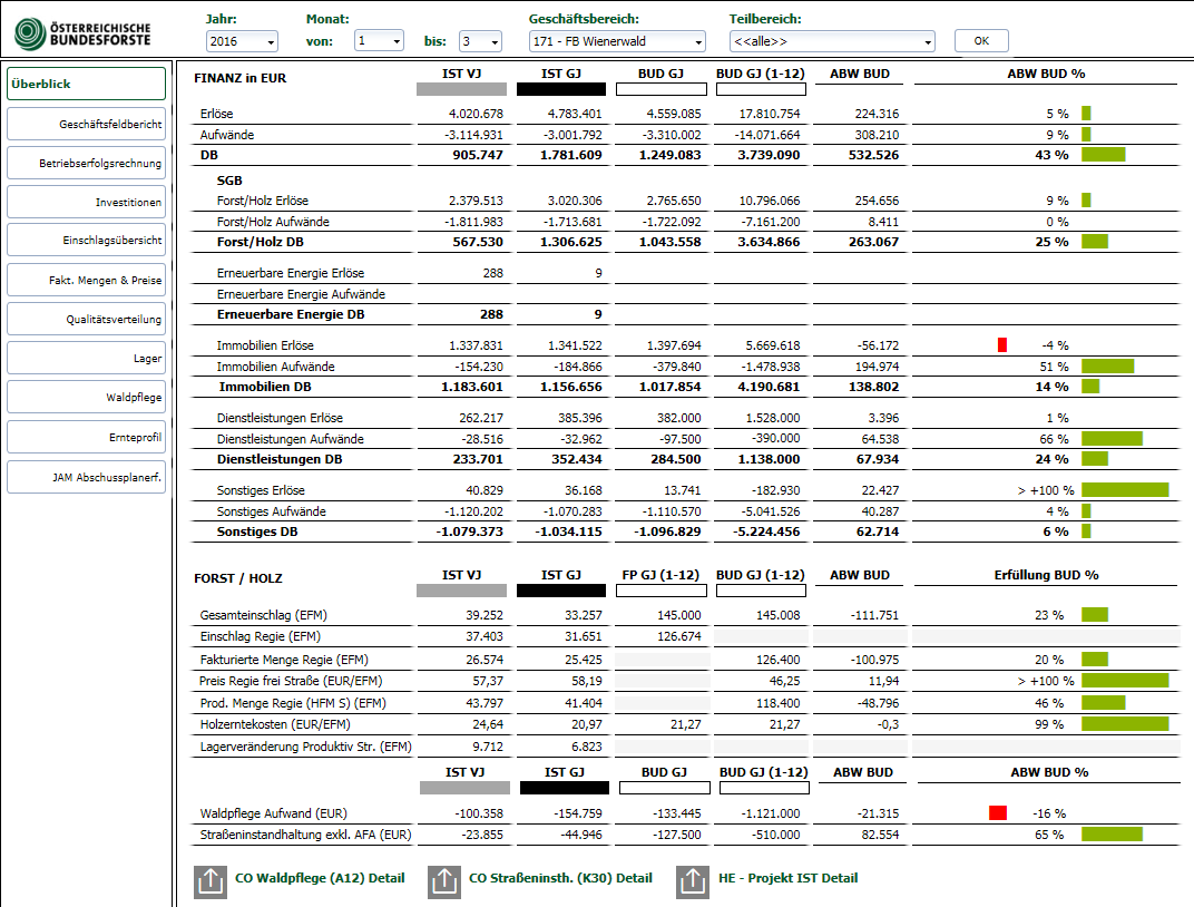
In the overview page, a total of 14 data sources (previously 14 individual reports, which had to be selected separately) were combined to form an overall picture of essential information. In this case, the report slightly deviates from IBCS standards. Instead of the usual pins, a bar graph was used for technical reasons. Scenarios and deviation colors are classed according to the IBCS standards. The selection in the central header area extends across all other pages. The user can jump to detail reports in the lower area using standardised icons. These reports are executed in Analysis for Office.