


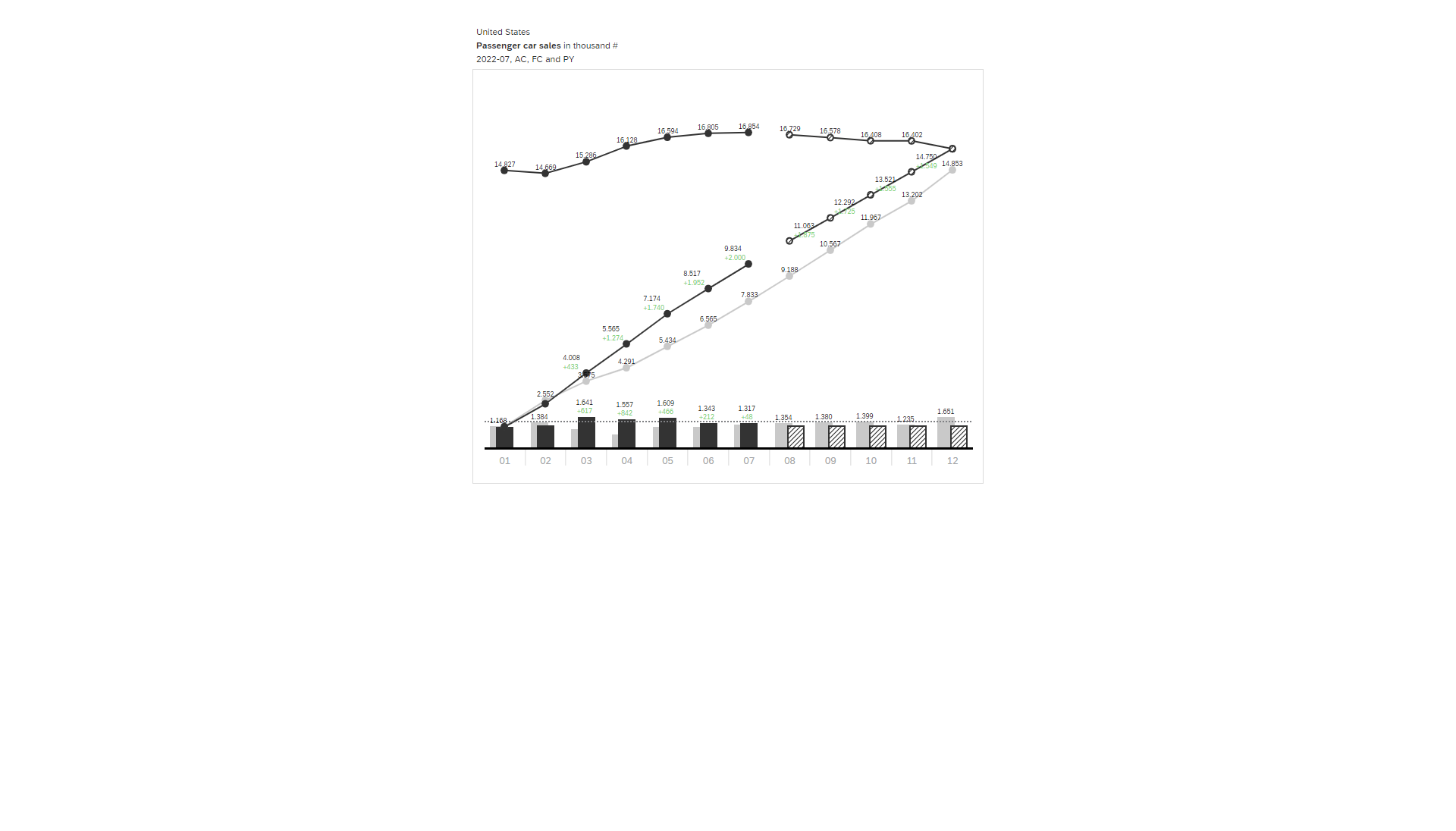
While the periodic values show the monthly values and the rising lines show the cumulated values, the additional lines on top of the chart (which generate the typically z-shape) show the “Moving Annual Total” (MAT) – a seasonal-adjusted visualization of the data. On the contrary of the statista-chart we see, that we don’t have a negative trend of used car sales.