


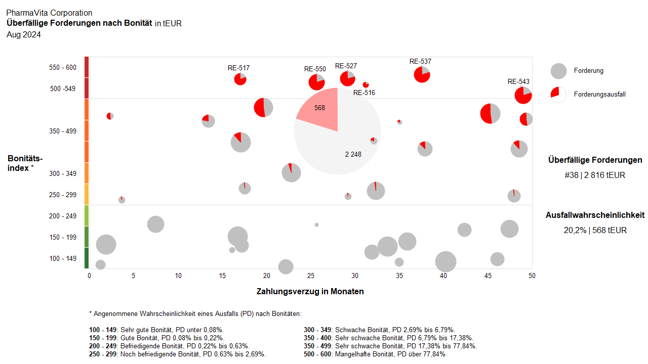
The request came from the Treasury department. The client was looking for a graphical visualization option for outstanding receivables. In addition to the outstanding receivables, information about the creditworthiness of the end customers was also available. The challenge, therefore, was to combine this information in a meaningful way and visualize it in a user-friendly manner.
This is a live analysis report (therefore no message is displayed). The outstanding receivables are shown as a portfolio graphic with integrated pie charts. The size of the bubbles represents the amount of the receivable, and the pie chart illustrates the likely default rate based on creditworthiness.
The total expected default amount across all receivables is shown as a more subtle pie chart in the background of the detailed graphic. The position of the overall pie is dynamic and is calculated based on the average payment delays and the calculated creditworthiness derived from the percentage of expected defaults.