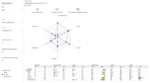
I’m aware that with the Radar Chart we are indeed not following the ideal example of IBCS here. The lines imply a relationship between the Categories of Country Risk that does not exist. Furthermore lines determine a gradient or area, which does not exist either. But the customer is used to this chart type and his aim is to recognise a trend suggested by the lines between the Categories.
With the IBCS conform table an alternative is offered, with the additional information of comparing more than two countries as well as the delta deviation from the previous year.


