


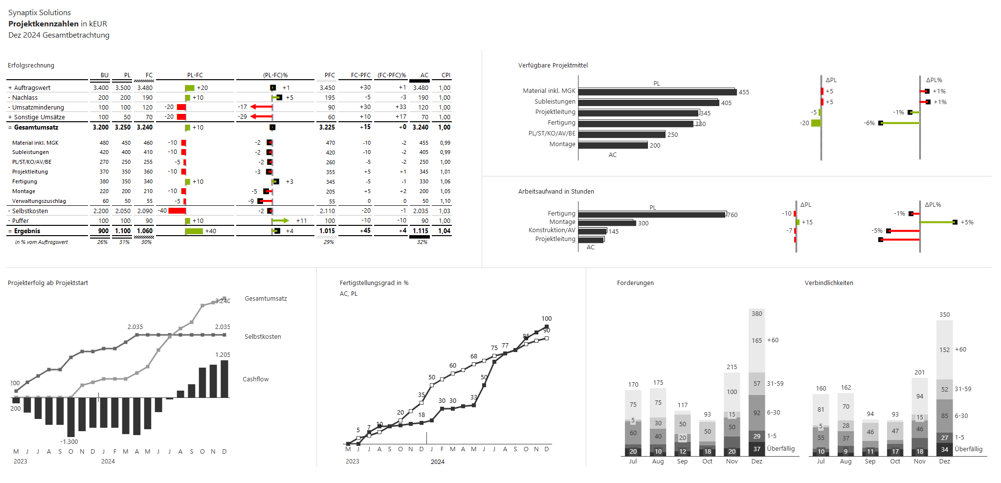
This work sample demonstrates how a manually maintained, hard-to-read Excel report was transformed into a structured and visually clear analysis report tailored to the needs of management and project managers.
The focus was on transforming a confusing numerical base into an interactive, IBCS-compliant dashboard. The new report layout allows for the quick identification of deviations and critical developments in the project progress – from income statements to resource utilization, cash flow, and receivables and payables. Especially for management, which previously operated “blindly,” the report now provides a clear foundation for informed decision-making and initiates further detailed analyses.
By automating the visualization of relevant metrics, transparency is created – leading to more efficient project management and improved communication within the company.