
Matija Prijatelj
Matija Prijatelj is a Video Content Creator at Zebra BI, where he educates viewers on best practices for data visualization in Power BI and Excel with IBCS standards through engaging YouTube content. Zebra BI specializes in creating actionable business reports that provide immediate insights, empowering decision-makers to take the right actions efficiently.
About
Matija Prijatelj is a seasoned data analytics leader specializing in BI strategy, data storytelling, and standardized reporting.
With a degree in Social Informatics (University of Ljubljana), he combines technical mastery of SQL, Power BI, and Excel with cross-sector expertise to deliver actionable insights. At A1 Slovenia, he led enterprise BI projects, mentored global teams, and designed innovative analytics solutions, earning recognition in the Telekom Austria Group’s Young Potential Program and contributing to an award-winning ESG initiative.
As an IBCS Certified Consultant and Zebra BI’s Video Content Creator, he empowers organizations to create compliant, visually compelling reports that simplify complex data.
Beyond his technical work, he drives leadership development as a Program Committee member for AmCham’s Young Leaders Club, advocating for mentorship and collaborative growth strategies.
Matija bridges technical expertise with strategic outcomes, ensuring data becomes a universal language for decision-makers.

IBCS® Certified Consultant
Matija Prijatelj has successfully completed the IBCS® certification for successful design of reports and presentations at the IBCS Institute in February 2025.
Work Sample 1
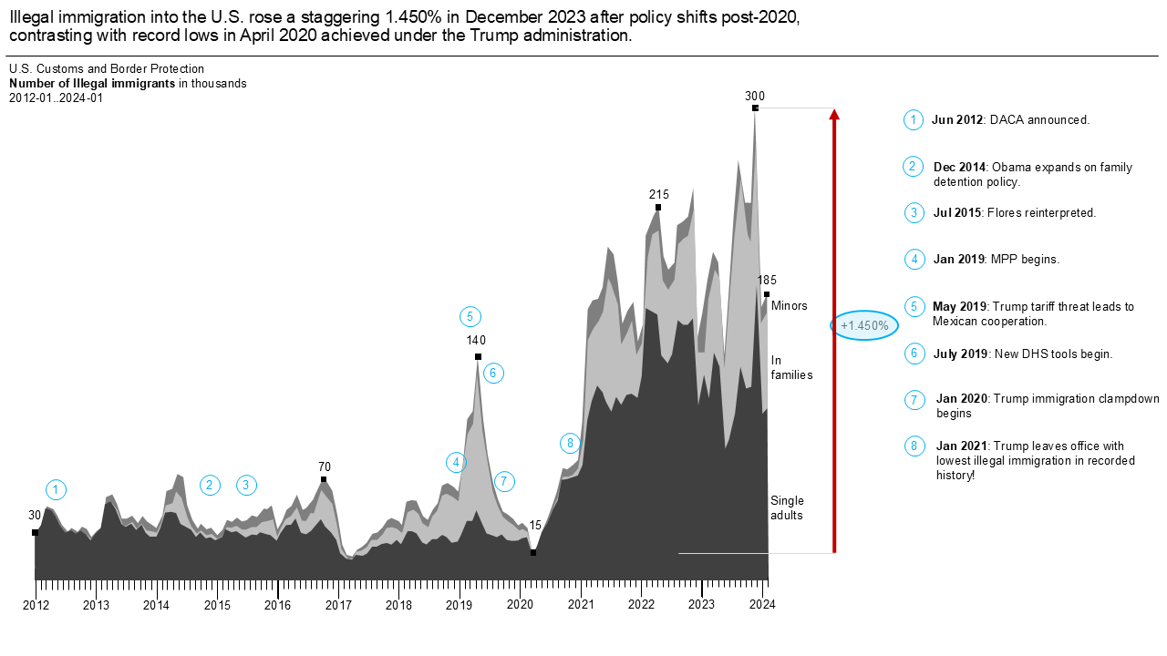
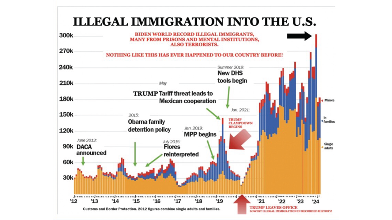
The original (slide 2), most famous visualization of 2024 – an example of how clutter can dilute a message. The key transformation is the clear difference highlight, emphasizing the rise in illegal immigration. Whether the data is accurate remains debated.
-
Work sample 1 - after
-
Work sample 1 - before
Work Sample 2
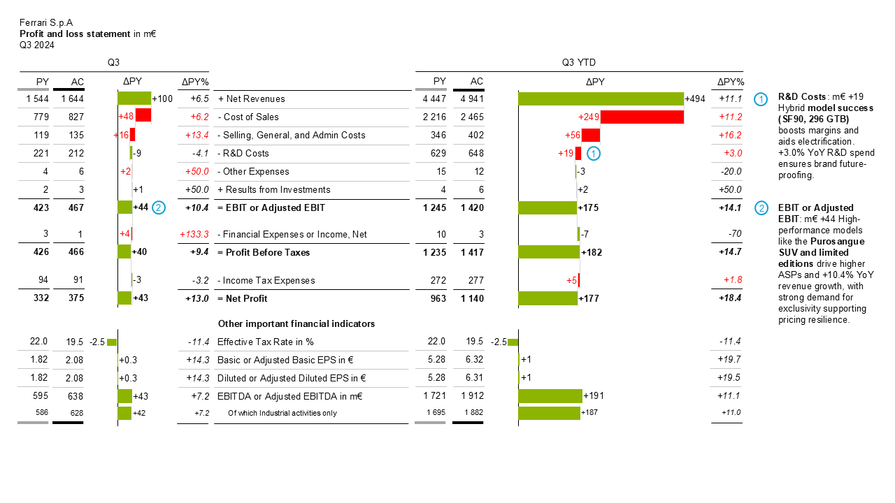
The original (slide 2) already provides some good points but the rework is a strong example of how effective visualizing financial statements flow can be. The variance waterfall chart highlights absolute variances, while Q3 and Q3 YTD figures provide both short-term and year-to-date perspectives for strategic insights.

-
Work sample 2 - after
-
Work sample 2 - before


