


Michael Darnieder
Michael Darnieder is the CEO and founder of TEDEXA GmbH and integrates AI, data, and processes in a way that delivers measurable benefits for businesses. His holistic approach to AI combines strategy, technology, law, ethics, culture, and implementation—ensuring that ideas are transformed into effective solutions.
About
Michael Darnieder earned a degree in computer science in Wiesbaden and, even while still a student, developed custom software solutions and data-driven applications for mid-sized companies and corporations in retail, banking, media, and telecommunications.
Since 2010, his focus has been on the renewable energy sector—where complex processes, data, and digital transformation intersect directly. With TEDEXA, he develops custom software solutions that help companies better understand processes, make more data-driven decisions, and harness digital potential.
Since 2017, he has been deeply engaged with data science and artificial intelligence. To not only keep pace with a rapidly changing environment but also to provide sound advice, he regularly pursues further education at renowned universities.
Today, he combines technological depth, industry expertise, and strategic consulting into a holistic AI approach. His goal: not to treat AI as just another tool hype, but to embed it in companies in a way that is economically effective, legally sound, and culturally sustainable. Especially in the renewable energy sector, he sees this as a key lever to accelerate the path toward 100% renewable energy.
His motto: Every company needs to think AI-first.

IBCS® Certified Consultant
Michael Darnieder has successfully completed the IBCS® certification for successful design of reports and presentations at the IBCS Institute in May 2026.
IBCS Work Sample – From Excel Chart to Decision-Oriented Report
The biggest challenge in this work sample was not converting an existing report to be IBCS-compliant. The real difficulty lay in figuring out what the original report was actually supposed to show.
A. Initial Situation
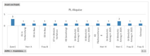
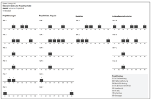
The existing reports were based on an Excel-style data structure. There were many variations of very similar charts, pivoted by role or by status.
In terms of content, these visualisations looked at the same data, just from slightly different perspectives. Furthermore, the volume of data was very small. In many charts, the value was almost always simply ‘1’. This made it difficult to tell at first glance whether a cluster, a trend, a workload or a project’s progress was being depicted.
Note: The term ‘milestone’ was used synonymously with ‘status’.
The key question was therefore initially: Which management or control question is the report intended to answer?
This question could be translated into two main perspectives:
A.1 How are the managed projects distributed by role, person and project status?
This concerns transparency regarding operational project responsibility. Who is managing which projects? What is their status? And where are potential bottlenecks arising?
A.2 How is the project pipeline developing across milestones and quarters?
The focus here is on when projects reach certain milestones and what output is associated with them. It was important to distinguish between the number of projects and installed capacity, as both metrics provide different insights.
A.2.a The number of projects indicates the volume of processes
How many projects reach a specific milestone in a quarter? This is important for operational workload, process throughput, processing effort and capacity planning.
Example:
If five projects are submitted for approval in Q2, this entails a significant amount of coordination, documentation and consultation work — even if the underlying installed capacity is comparatively low.
A.2.b Installed capacity in MW, on the other hand, reflects economic or strategic significance
What is the potential capacity behind the projects that reach a milestone? This is important for portfolio value, revenue potential, pipeline quality and strategic planning.
Example:
A single large project with 25 MW can be economically more significant than five small projects of 5 MW each. In terms of project count, Q2 then looks ‘small’, but in terms of capacity, it is very significant.
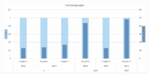
A.3 Current reports from the customer’s Excel file (anonymised)
A.3.1 Reports
A.3.1.1 Number of projects and installed capacity for the ‘Application submissions’ status
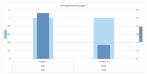
A.3.1.2 Number of projects and installed capacity for the ‘Approvals’ status
A.3.2 Reports on managed projects and status by role
A.3.2.1 Number of managed projects and status for the Project Manager role
A.3.2.2 Number of managed projects and status for the Project Akquisition Manager role
A.3.2.3 Number of projects managed and status for the role of Field Sales Representative (ADMA)
B. Implementation
The existing reports were not simply revised. Instead, completely new reports were developed based on the actual questions at hand.
In the first step, the existing reports were analysed and their content deciphered: Which dimensions are used? Which key figures are shown? Which variants are merely technical or Excel-related derivations of the same view? Subsequently, the relevant questions were identified and the original chart variants reduced.
In the second step, the data was prepared so that the reports could function consistently. It was particularly important to fully map missing categories such as quarters or project status, even if no value was available for individual combinations. Furthermore, a clear distinction had to be made between actual values and future forecast values.
In the third step, two key reports were redesigned and implemented.
B.1 New reports
B.1.1 Report 1 – Number of projects managed per role, person and project status
The first report shows the number of projects managed per role, person and project status. A small-multiple structure was chosen for this. Instead of placing several isolated individual charts side by side, a unified view across roles and individuals was created. This makes it easier to see how projects are distributed across responsible parties and statuses.
Transformation (rough)
![]()
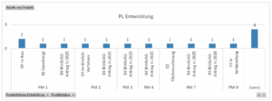
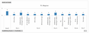
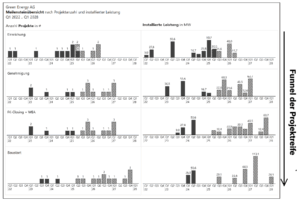
B.1.2 Report 2 – Number of projects managed per role, person and project status
The second report shows the milestone development by number of projects and installed capacity. A small-multiple structure was used here too. The number of projects and capacity were deliberately separated but presented in a way that allows them to be read together. This provides a clear view of the project pipeline: which milestones are achieved in which quarters, and what MW capacity is behind them?
Transformation (rough)
![]()
Comments:
- The report can be read like a project funnel. The milestones do not represent a rigid timeline, but follow the procedural sequence and maturity logic of a wind energy project. The further down a project appears in this funnel, the further it has progressed in the development process – and the more technical work, coordination and investment has already gone into it.
- FORECAST instead of PLAN. Future dates are not presented as a PLAN but as a FORECAST:
Reason: A plan is what you want to happen. A forecast is what you expect will happen.
Forecast is more appropriate here, as one is always dependent on others: the pace of work by the authorities, suppliers’ scheduling, cooperation from local authorities, …
C. Conclusion
The result is not a cosmetic redesign of existing Excel charts, but a technical redevelopment of the reports. The starting point was not the question How do we make this chart IBCS-compliant?, but rather: Which decision should the report help to make more effectively?
This was precisely the crux of the work sample: to develop a clear reporting structure from unclear, varied initial evaluations, making status, responsibility, milestones and pipeline development understandable and comparable.