


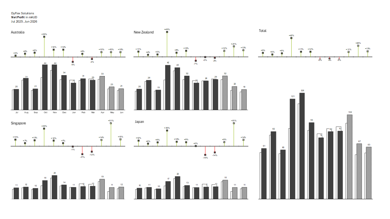
This dashboard aligns with IBCS standards through consistent use of chart types, colours, and semantics, enabling quick and intuitive comparison across regions and time periods. Variances are clearly highlighted using standardised colour conventions (e.g. positive vs negative), while actuals, prior year, and forecasts are presented in a structured and repeatable layout. The clear separation of totals and regional views, along with concise labelling and minimal visual clutter, supports accurate interpretation and decision-focused storytelling.