
Severin Willig
Severin Willig is working as a Manager in the Data & Analytics team at PwC GmbH WPG.
About
Severin Willig has several years of experience in SAP BW implementation projects, his focus is on frontend technologies. He is specialized in Reporting, especially with SAP Analytics Cloud, SAP Design Studio and SAP Lumira. In the recent past he also gained comprehensive knowledge in Zebra BI for Microsoft Power BI. He supports the implementation of BI strategies where IBCS® is asked for more frequently by clients now. Furthermore, he applies the IBCS® Standards internally, for example by restructuring the global Reporting.

IBCS® Certified Consultant
Severin Willig has successfully completed the IBCS® certification for successful design of reports and presentations at the IBCS Institute in November 2020.
Work samples
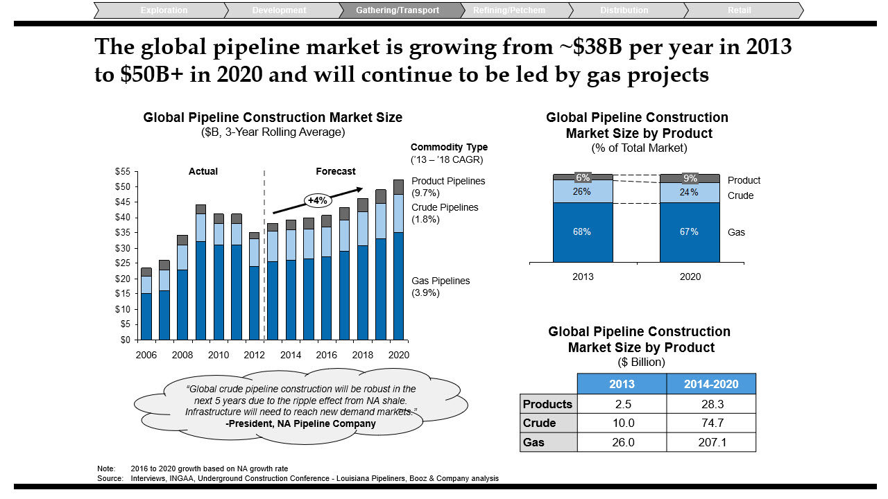
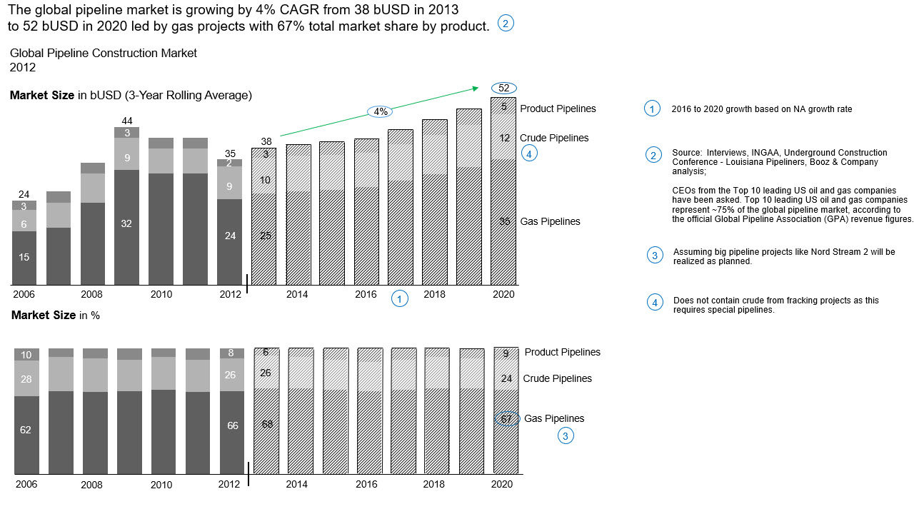
Market size in a Ggobal pipeline market
The report shows the market size in the global pipeline market in both absolute and relative terms. The reader can immediately see in the upper diagram that the market is expected to grow until 2020. Likewise, the reader can directly record and classify the shares of the individual pipeline products using the lower diagram.
-
This is the original before applying IBCS ...
-
... and this is the make-over.
Performance analysis of a reporting unit
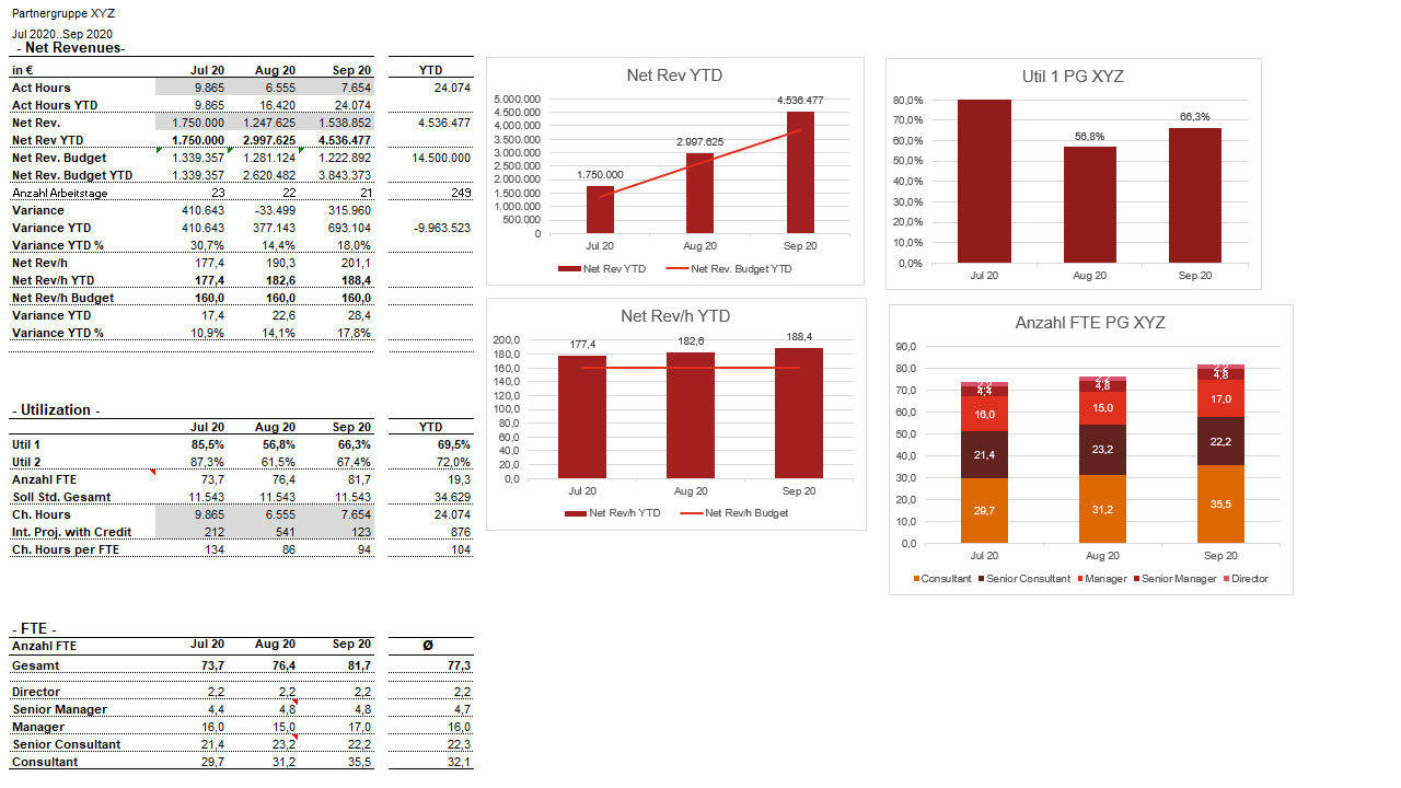
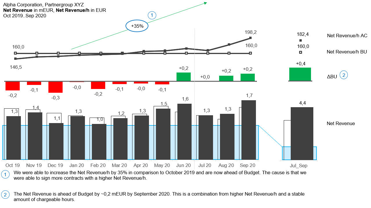
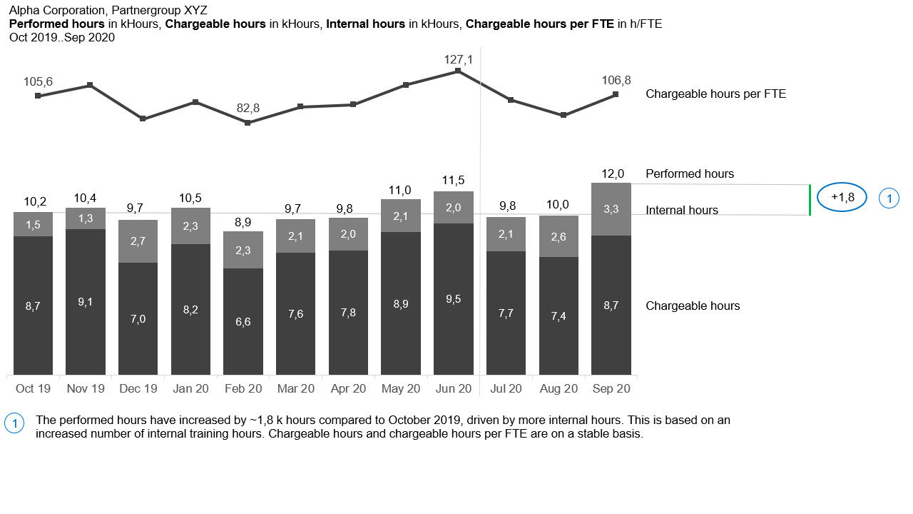
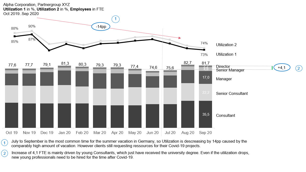
This report displays the performance analysis of a reporting unit in a consulting company.
-
BEFORE applying IBCS: The most important analysis key figures (net revenue, utilization and FTE) are shown both in tabular form and in charts.
-
The MAKE-OVER shows only three charts (for better display here shown in three pictures). On the first chart you can see the net revenue as well as the net revenue/h the deviations at a glance. Highlighted figures are commented.
-
In the second chart performed hours are split into internal and external (chargeable) hours and displayed in a stacked way. Additionally, chargeable hours are shown by FTE as well.
-
In the third chart FTE are displayed in their individual hierarchical levels as a stacked chart. The two utilization figures (Utilization 1 and Utilization 2) can be directly recorded by the reader and put into context. Important explanations are attached as comments.
XING Expertendialog
Severin was one of the speakers at the XING Expertendialog on July 15.
To watch the full session (in German) click here. Severin presented the following work samples:
-
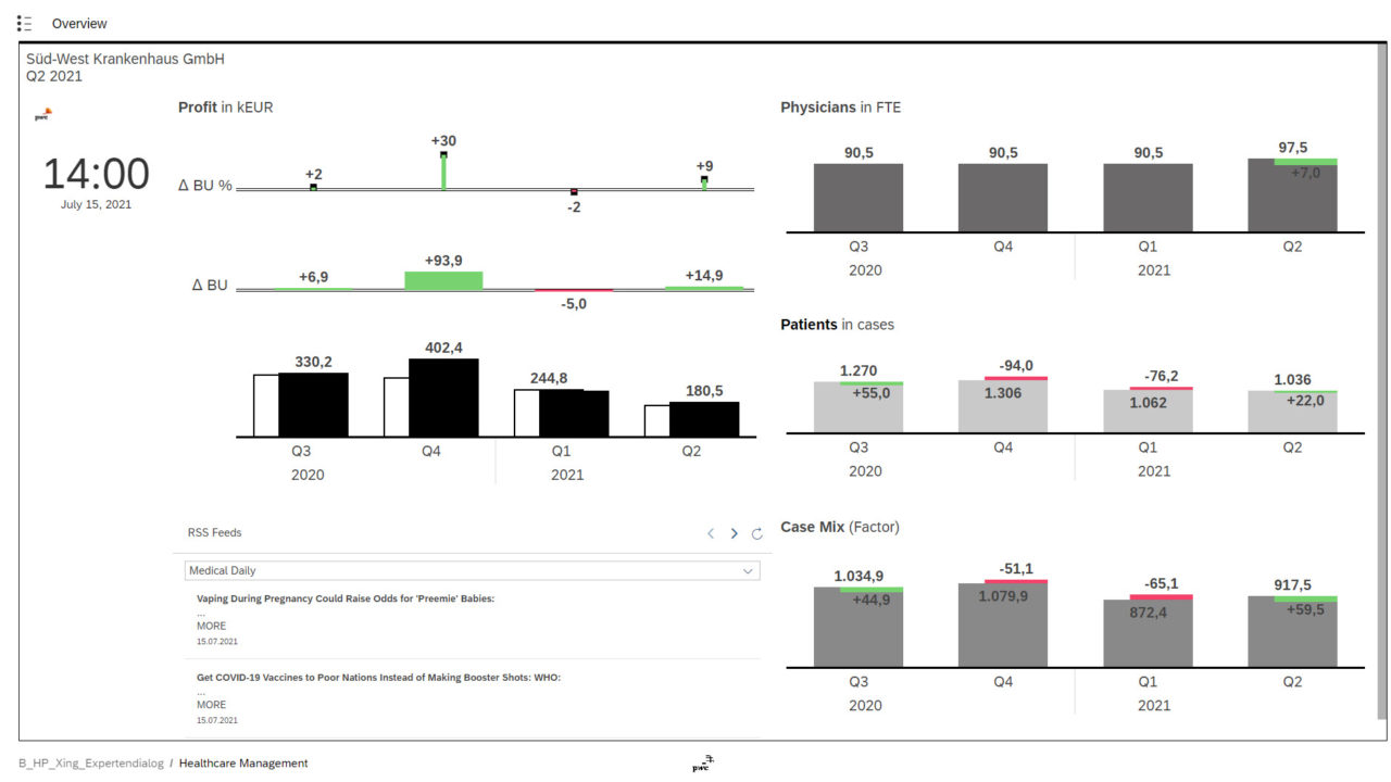
Overview Page The report (build in SAP Analytics Cloud) shows an overview of the most important KPIs in a hospital for example the profit, combining them with external information e.g. via RSS-Feed.
-
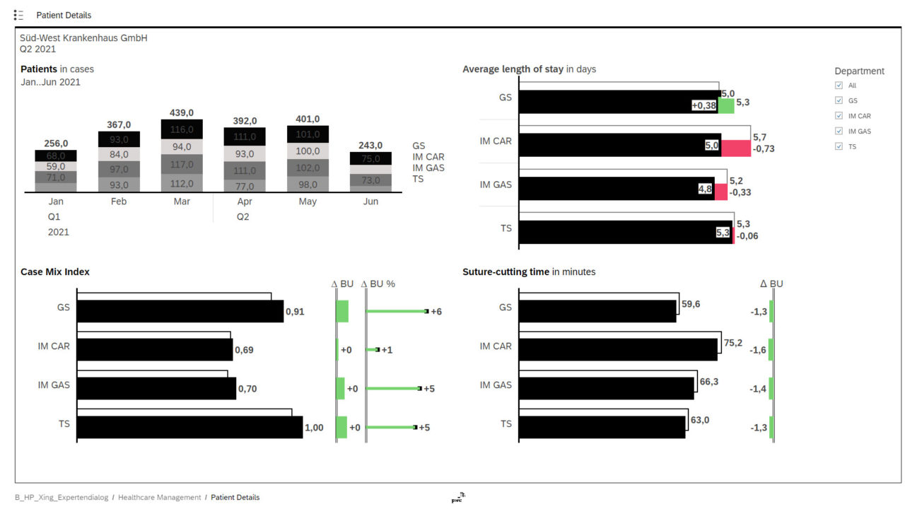
Patient Details Through "jump to" functionaliy the patient overview is shown, which contains relevant data for the number of cases, the case mix index or the average lenght of stay in the hospital.
-
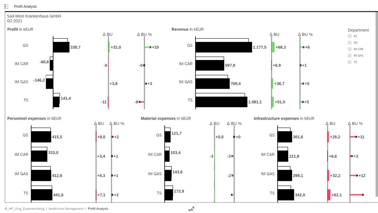
Profit Analysis On the next page, financial data can be explored on an aggregated level. There are values given for expenses, revenue and profit each by the respective department.
-
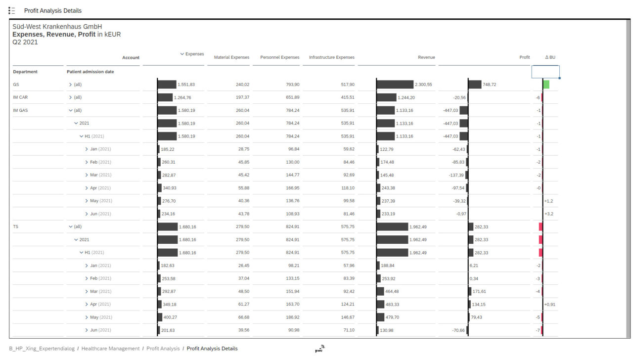
Profit Analysis Details For deeper analyzing the financial KPIs you can jump from the page before to the given table. Through In-Cell-Charts it is possible to visually understand the ratios between the figures.


