


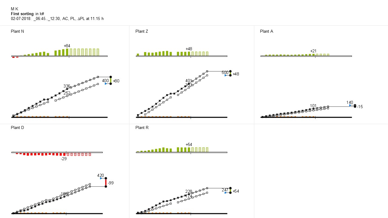
This chart gives an overview of the progress of the production of one machine in all plants during a shift. Shown are the cumulated planning and cumulated actuals and the variance of those two. Added are the expected total production (blue triangle) and whether data from the machine has been provided (the orange dots on the baseline). No need for a legend, since there is a limited group of specialized users.