
Swiss Post Financial Report 2009..2018
Swiss Post has set new standards in visualization to a large degree with its 2009 financial report, which appeared March 2010 in four languages. We know of no other annual report in which value was placed so consistently on all visualized charts aimed at conveying information quickly and clearly: uniform titles, uniform scaling (!), uniform notation and lately even messages above each chart – based on the SUCCESS formula of IBCS®.
You can download the entire 2018 financial report from here. Be sure you check the note on standardization in the legal notice.
Financial Report 2018
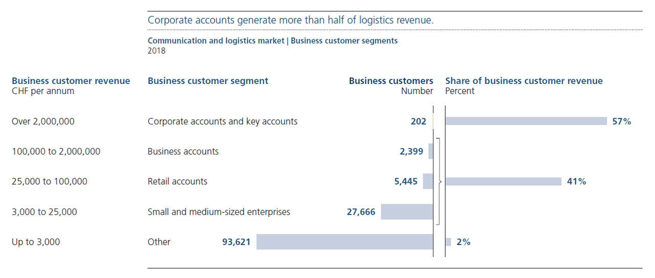
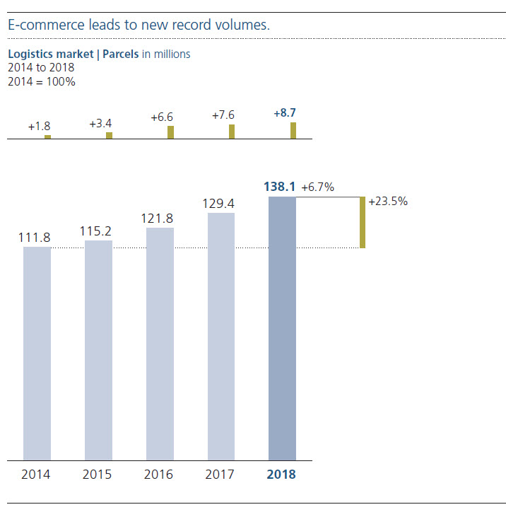
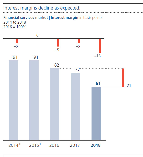
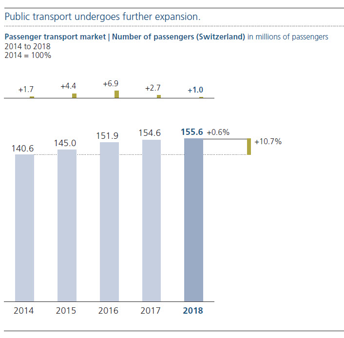
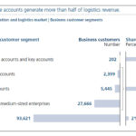
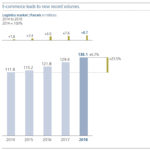
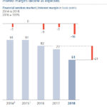
For one year now, all charts have short messages in order to make them understood more quickly. These messages such as “Corporate accounts generate more than half of logistics revenue” (page 7) could be more precise and they could be highlighted in a proper way – but also here the Swiss Post sets standards.
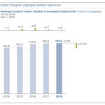
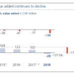
Financial Report 2015
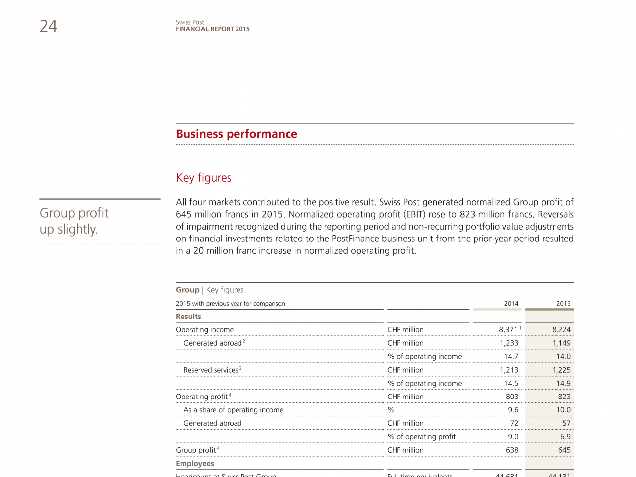
In their 2015 financial report the Swiss Post has even fixed th sequence of the years in tables: Now time is running from left to right, also in tables.
-
Tables Time is now correctly running from left to right.
Financial Report 2012
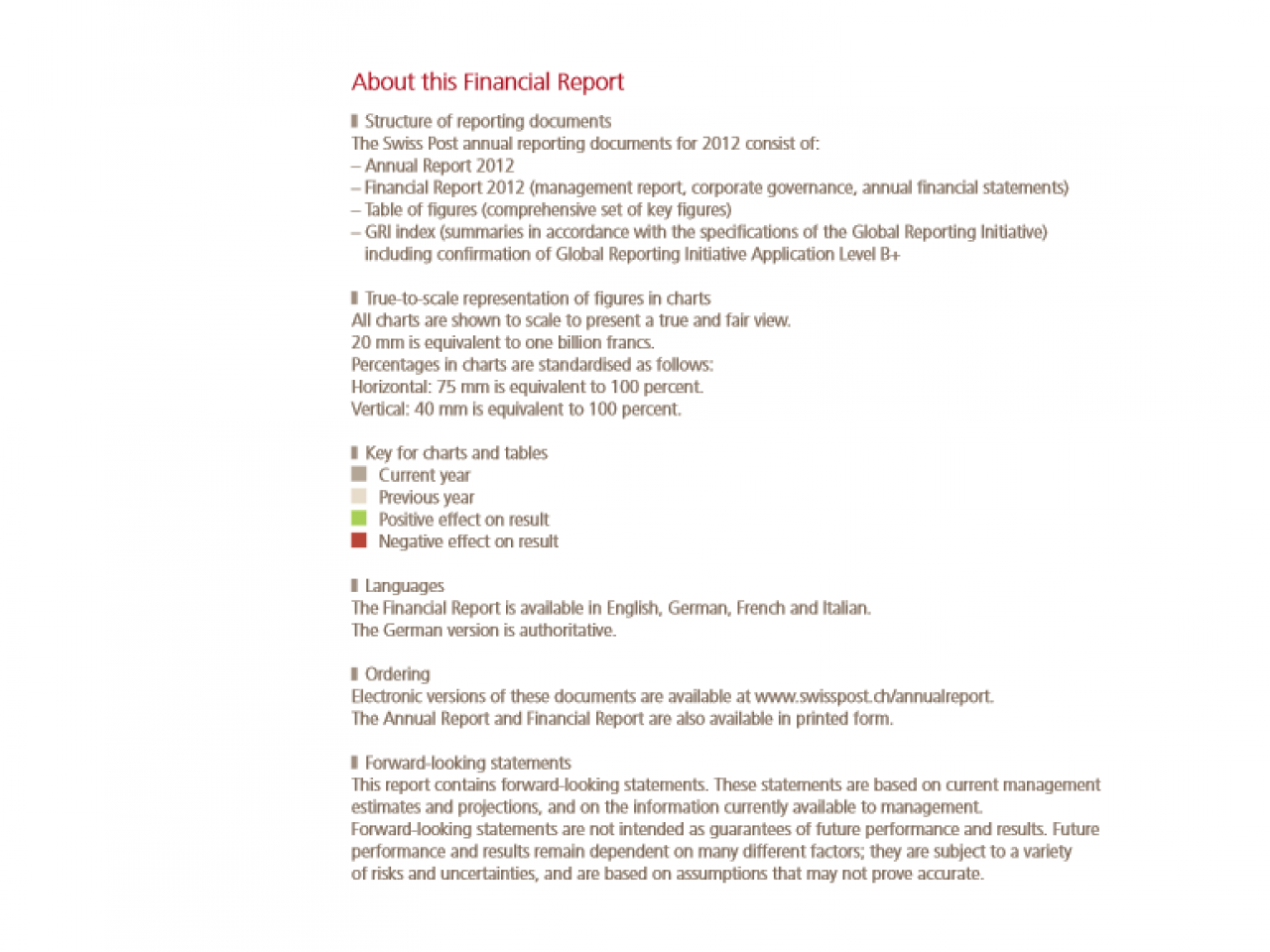
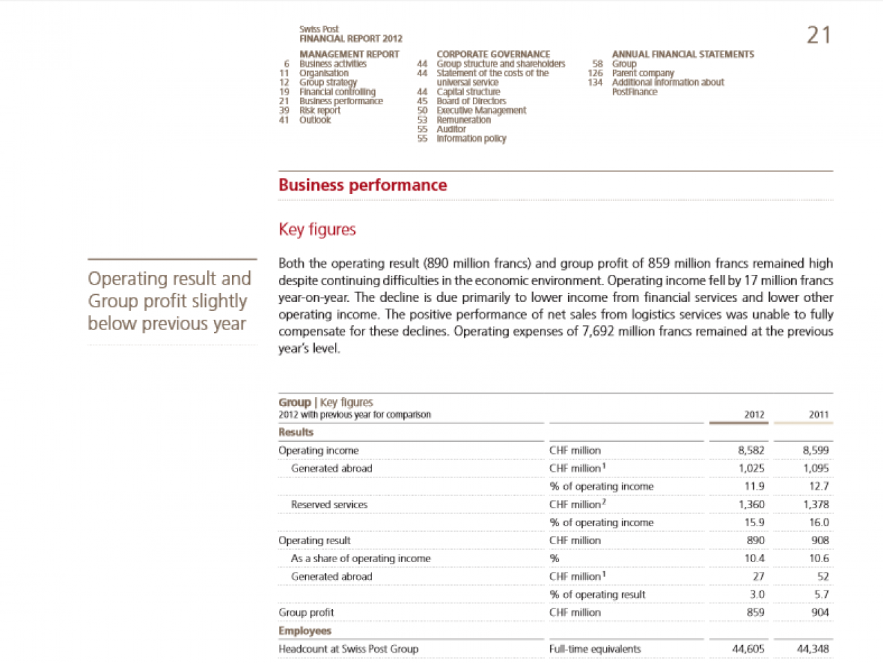
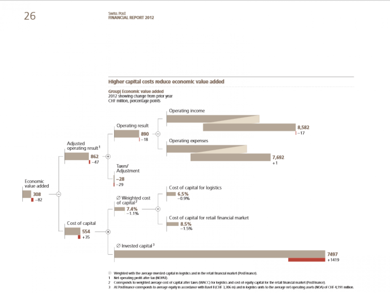
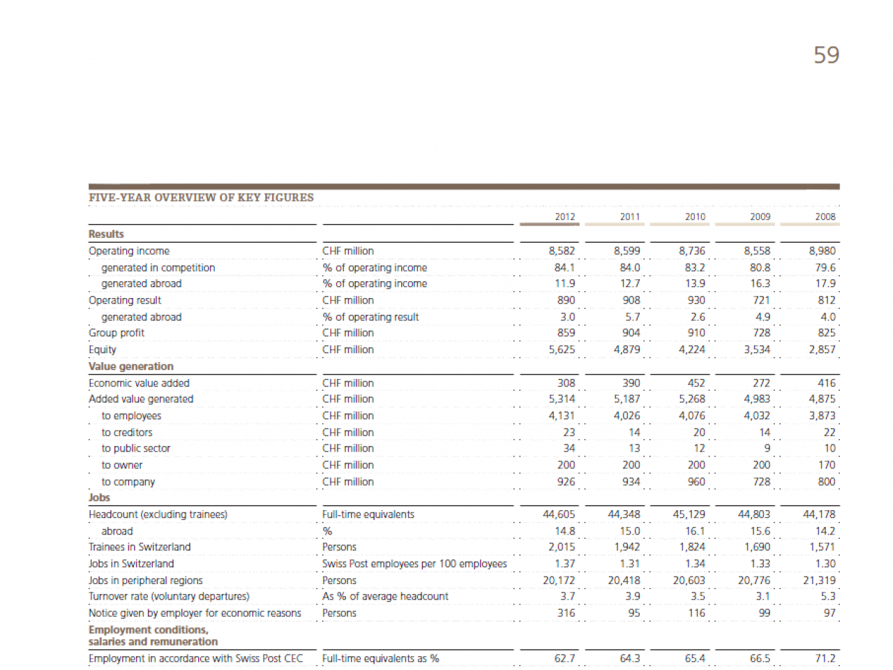
New: All charts have a message; that is something special. These messages are, however, not yet highlighted in the picture and are primarily mere determinations.

-
Legal notice True-to-scale representation of the figures in charts.
-
Key figures Tables still have time running in the wrong direction, however with uniform notation in the table header.
-
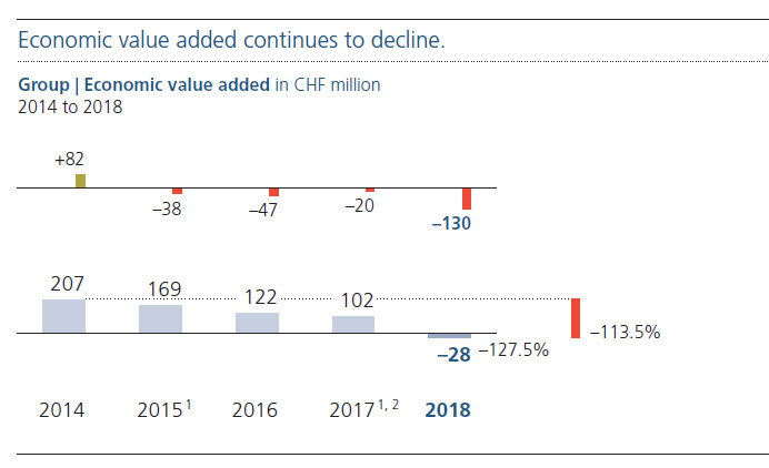
Economic value added Charts are scaled correctly
-
Operating income and operating result Charts are scaled correctly.
-
Five year overview of key figures Tables still show time running in the wrong direction, however with uniform notation in the table header.
Financial Report 2009

-
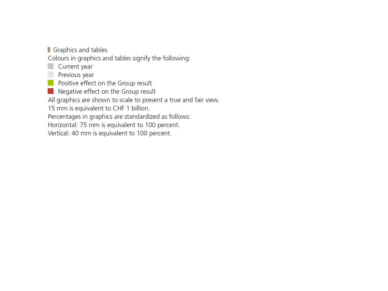
Legal notice Previous year, current year, positive and negative deviations are as clearly regulated as is the note on scaling: 1 bn Swiss francs are equal to the length of one visualization unit (exactly 15 mm) in the charts.
-
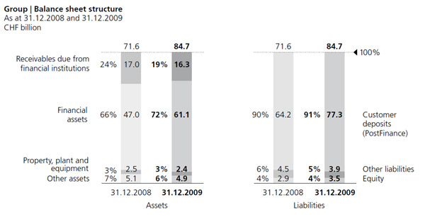
Balance sheet An improvement over the previous year, the visualization selected here includes values in million placed consistently within and above the columns –percentage values, on the other hand, are placed outside the columns.
-
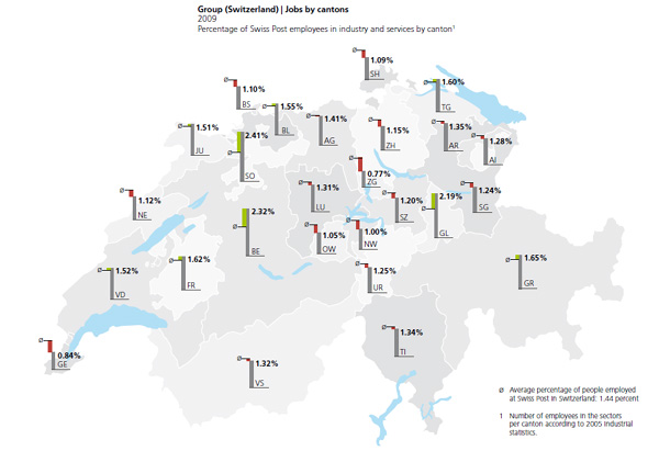
Map In this visualization of deviations in employment compared to the average in Switzerland, the areas are (correctly) not colored in, columns are used instead.
-
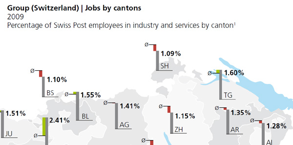
Map detail In this map detail, you can clearly see the use of a uniform title concept. This visualization is very clear – you can quickly spot the deviations from the average.
-
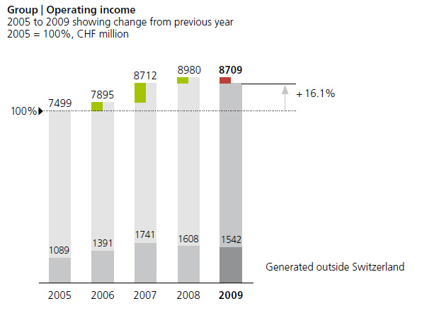
Operating income by year This is a classic visualization, clear and easy to understand. Unfortunately, a well-formulated message is missing in nearly all of the charts (still) – but here we already see the highlighting needed to underscore the messages (+16.1% in four years).
-
Operating income by type Percentage deviations compared to the previous year are displayed to the right of the integrated deviations from absolute values.
-
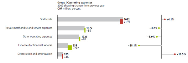
Operating expenses by type This comparison illustrates the advantage of using the selected color notation: The different directions used for positive and negative deviations (in relation to the company results) is easily identified.
-
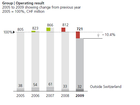
Operating result by year Here you can immediately see the result of indexed figures for operating result and operating expenses: The deviation from the 2005 reference value is clearly highlighted.
-
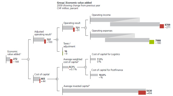
Company value It is great to see how two visualization rules can be adhered to consistently, as is the case here: uniform scaling of all comparable measures (mn CHF, on the one hand, and percentage values, on the other) and a creative visualization of large-scale figures to avoid "signs that lie" (see the 2008 Annual report).
-
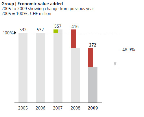
Company value by year This visualization is again a classic: clear, well labeled, no unnecessary embellishment.
-
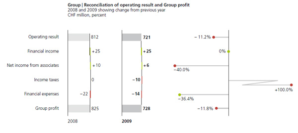
Transition In this transition from the operating result to the group result, you can clearly see how slight the effect from non-operative factors are. The consistent positioning of the labels is also very good here: positive figures on the right, negative figures on the left of the deviation bars.
-
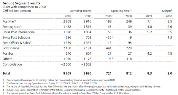
Segment earning This table is clear and easy to read: The right-aligned column headers make it possible to omit vertical lines. It is also very nice that the notation of actual figures for the previous year (light and dark gray lines) were used here as well.
-
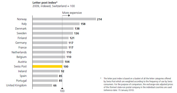
Letter index The use of yellow here to visualize own values is both elegant and practical. (Previously, yellow had been used as the color for various chart elements in previous annual reports.)
-
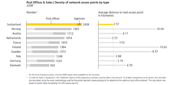
Network density This chart is an elegant visualization of this type of ranked distribution. Both the other notation for the “km” values as well as the numbers integrated in the picture for the notes at the bottom deserve particular mention.
-
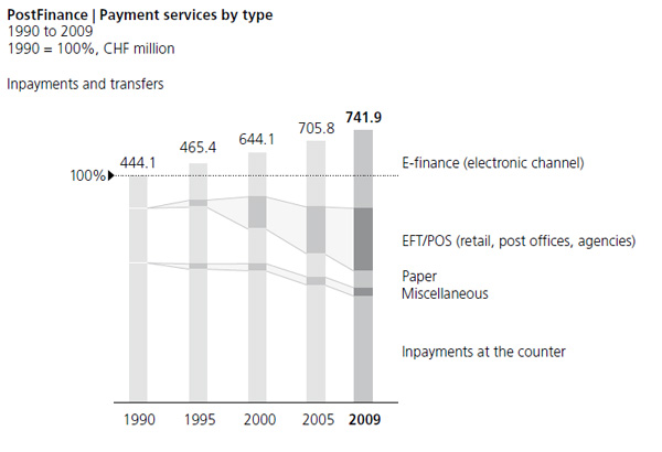
Payment services This visualization is also both transparent and visually appealing.


