
Alexander Pröm
Alexander Pröm works as a Senior Data & Analytics Consultant at Windhoff Software Services GmbH. Windhoff is one of the biggest German SAP Data & Analytics specialists.
About
Alexander Pröm is a Master of Business Informatics. He studied at the Management Center Innsbruck, Austria, and after a few years in different fields of informatics (IT-Support, IT-Project management and Consulting for automated testing) he started his career in the field of Business Intelligence in 2013. As a BI Consultant he was responsible for concepts, migration, development and adoption of SAP Business Objects Frontend (focus on WebIntelligence) and the SAP Business Objects BI Platform. In addition, he was head of the subject area “Automated Testing” at his former employer. He was dealing with the SUCCESS rules from IBCS® very early and could use his knowledge within several customer projects as well to support his colleagues. Today he focuses on the conception and development of SAP Analytics Cloud applications.

IBCS® Certified Consultant
Alexander Pröm has successfully completed the IBCS® certification for successful design of reports and presentations at the IBCS Institute in April 2015.
Work samples
ASTRA
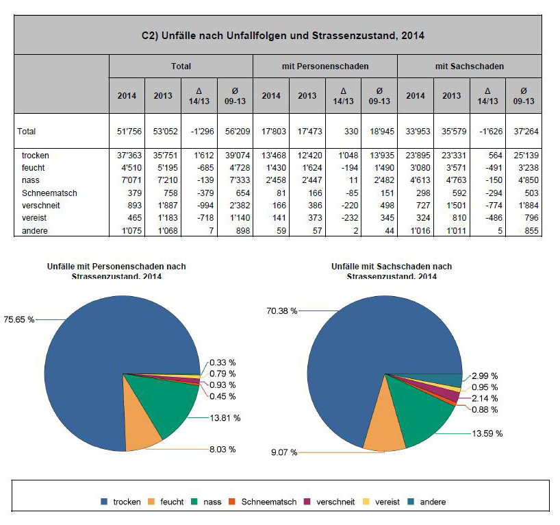
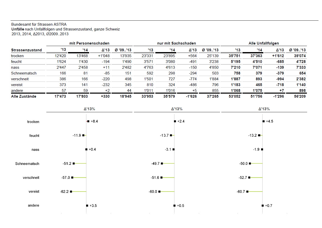
This example is a redesign of a traffic accident statistic with the standard features of SAP Business Objects Web Intelligence BI 4.1. Find the original document here.
A message was not included because it is not a report but a statistic. The title has been removed from the table, placed, according to IBCS®, on the top left and was adjusted with all required measures and dimensions. Unnecessary lines and colors have been removed and for better recognizability of the previous and actual year values semantic lines were added. The total line has been moved to the bottom and has been renamed from “Total” to “Alle Zustände”. To correctly display all of the variance values, plus-signs were added to the positive numbers. The illustration of accidents in % of the total with a pie chart is not very meaningful. As the information about accidents can easily be read directly out of the table, there is no need for a redundant chart. The space of the pie charts can be useful used to show relative variances. To show these values, 3 Pin-Charts were added and aligned to the table segments.
-
Before ...
-
... and after
HGC
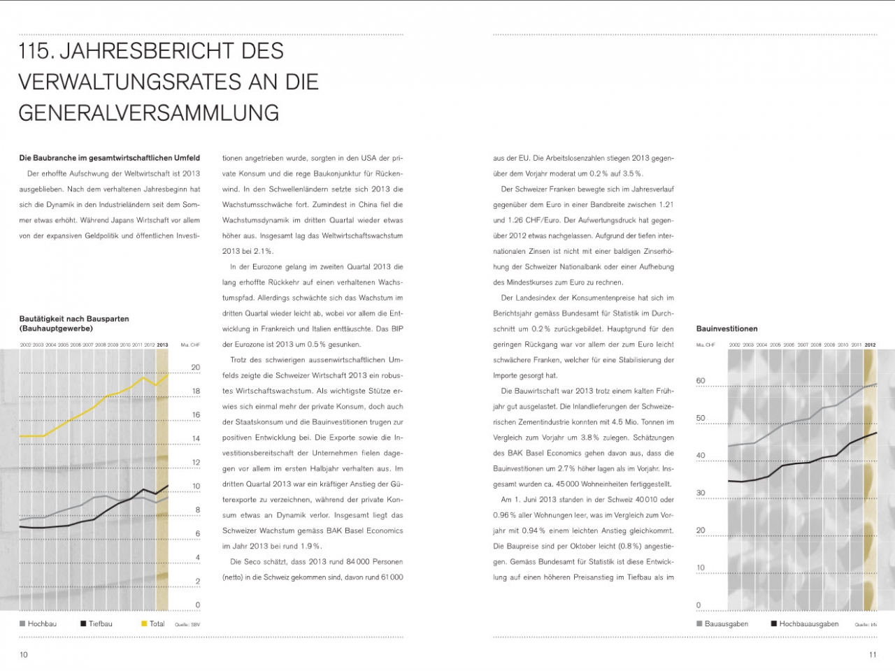
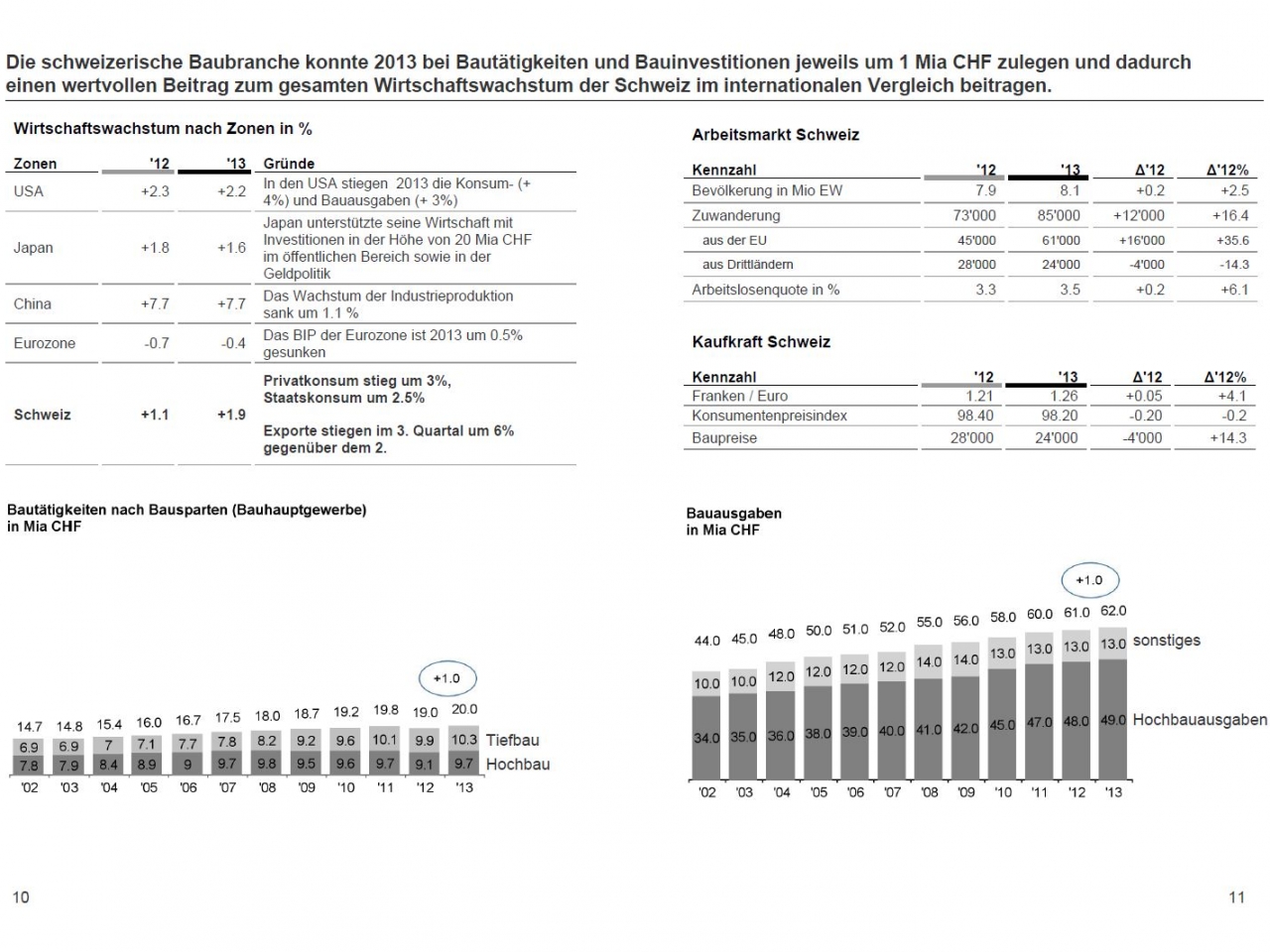
This example is a redesign of page 10 and 11 from the annual report 2013 from HG Commerciale with the standard features of SAP Business Objects Web Intelligence BI 4.1. Find the original document here.
Basically the whole report had potential for a redesign with IBCS® – for simplification a small extract has been taken. The two pages contain an collection of partial data wrapped in continuous text. In cases where measures were mentioned there is often the comparison (e.g. to previous year) missing or they are not exhaustive (e.g. economic growth of countries). In the text itself, many mundane phrases like “cautious”, “weakened”, “positive contribution”, “strong increase” and “loss of dynamic” were used without giving evidence about facts or numbers. The two charts are hardly readable and do not have the same time horizon. Because of the vertical lines in the charts it is not clear where the timeline for the years start (e.g. 2002). The grey background color makes it difficult to see the lines (e.g. grey line on grey background!). At the beginning of the text there is a title which was obviously meant to explain the content – it doesn’t.
The redesign started by giving the report a message and highlight the mentioned facts. The various numbers from the text have been consolidated in tables to make them structured and clearly readable – because of many missing values further research has been necessary. The tables were designed without vertical lines and semantic horizontal lines – according to the IBCS® Standards. For the redesign of the charts, stacked column-charts have been chosen as the proper visualization and labels were added. The legend has been removed and has been replaced by labels at the edge of the charts. The scaling of both charts has been adapted to be equal and as there is a total sum (“Bauausgaben”) but no measure for the rest on the chart “Bauinvestitionen”, the chart has been renamed to “Bauausgaben” and the measure “sonstiges” has been added. (Despite researching, there was no label found which makes more sense).
-
Before ...
-
... and after


