
Tobias Piecha
Tobias is Managing Consultant and Frontend Expert at blueforte GmbH, a consulting boutique for Data & Analytics solutions.
About
Tobias studied business administration at the Berlin School of Economics and Law. Since 2010 he works as Managing Consultant for blueforte GmbH. His know-how covers technical and business conception as well as the implementation of complex reporting solutions. In addition, he is a specialist in the field of information design.
His vision
- Develop interfaces for executives and technical experts that provide them with an optimal supply of information for their daily work.
- Design and implement reporting systems that technically and optimally adapt to the IT architecture of the customer’s organization.
- Further develop control instruments so that they logically map all relevant information correctly for each user.

IBCS® Certified Consultant
Tobias Piecha has successfully completed the IBCS® certification for successful design of reports and presentations at the IBCS Institute in April 2012.
Work samples
All samples are made with Microsoft Excel.
-
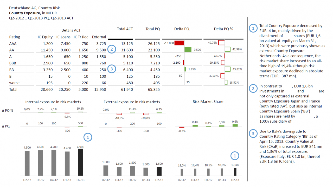
Country exposure (risk analysis) The main element is a visual table wich is clustered according to ratings including deviation charts. Furthermore this table contains detail analysis differentiated according to different investment types. An analysis of internal and external investments of the same period has been added.
-
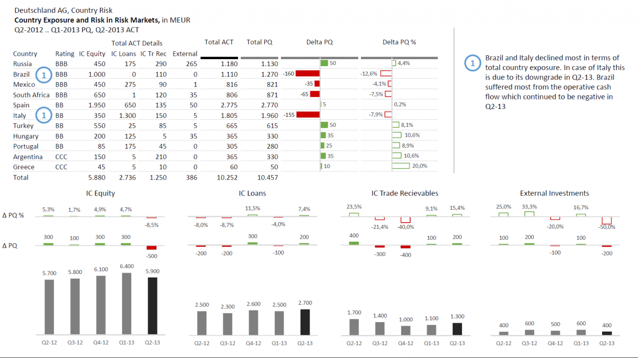
Country Exposure and Risk in Risk Markets The main focus of this example is on a tabular presentation of different risk markets, differentiated according to their ranking. The table was enriched by absolute and percentage deviation charts. At the bottom of this report I added charts for detail analysis of the investment types.
-
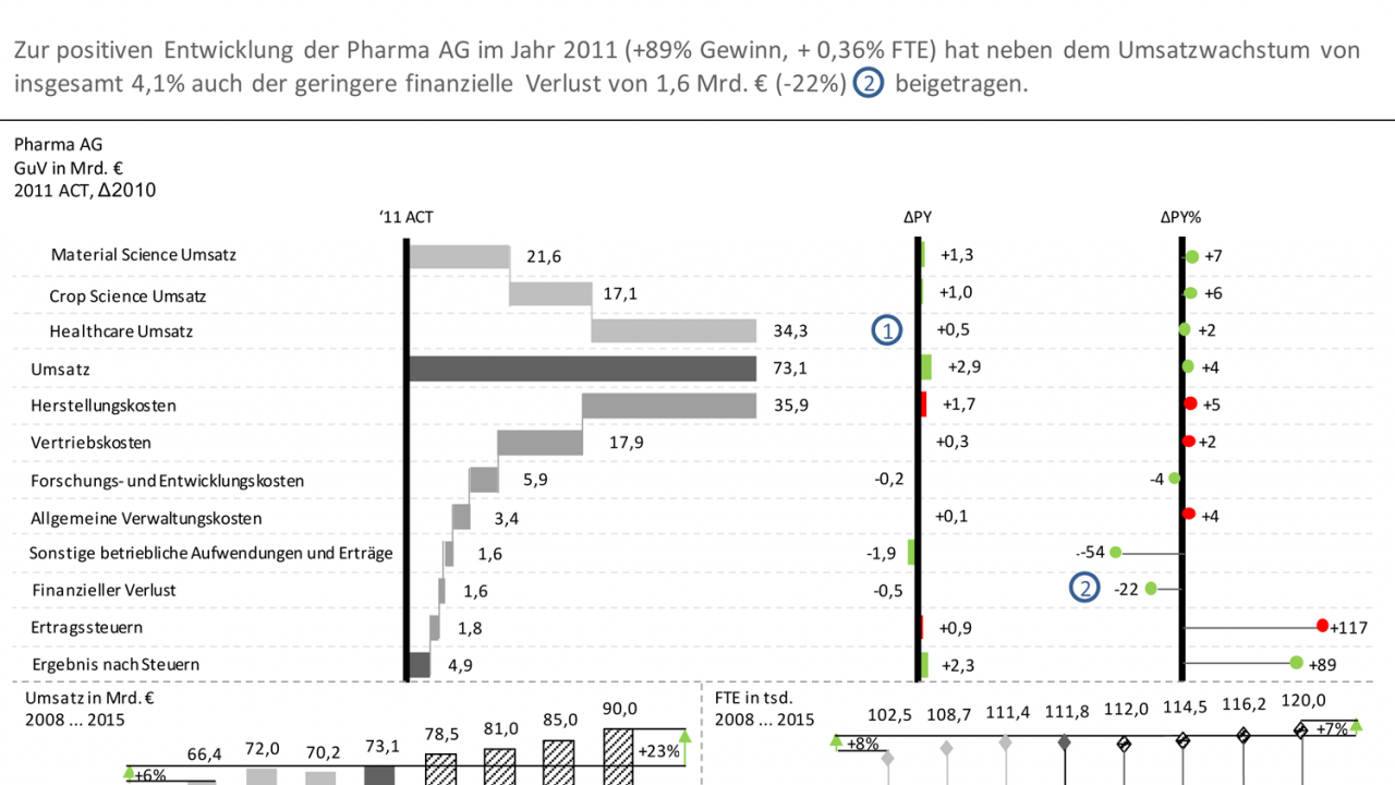
Profit and loss statement and base-KPI This example visualizes the financial trend in the form of a waterfall chart. To increase the level of information density, both the percentage as well as absolute deviations from the same period of the previous year as well as further charts showing sales and FTE of the last and coming years.
-
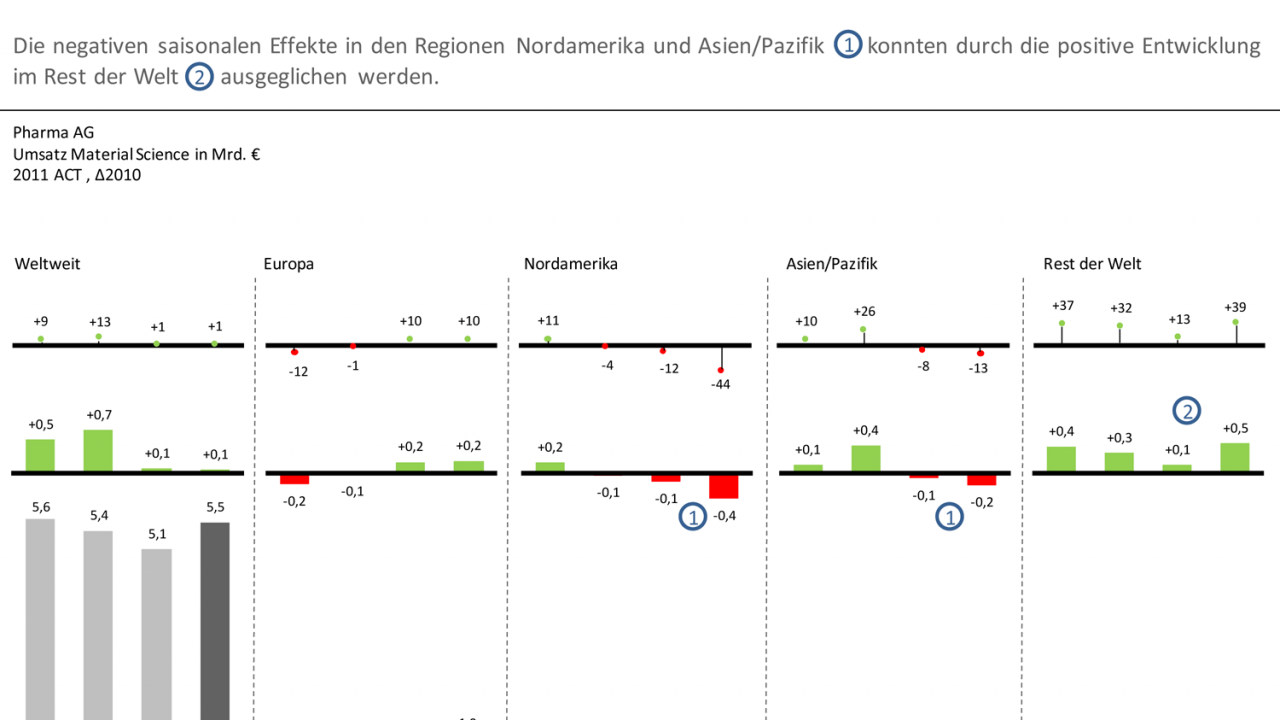
Regional revenue This example shows total sales and sales by region. The additional visualization of absolute and percentage deviations increases the level of information density.


