IWB-Swisspower Annual Report 2011
128 pages
Dr. Andreas Sturm of ellipson AG and Erik Rummer of IWB were responsible for the content-related conceptual design of this annual report.

-
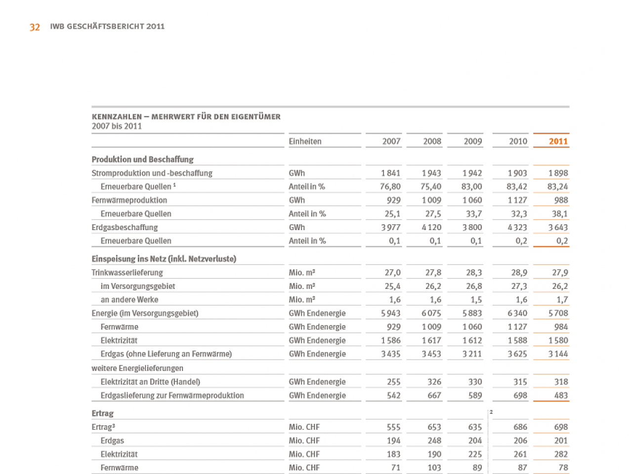
IWB-Swisspower Annual Report 2011 page 32 Tables show time running from left to right
-
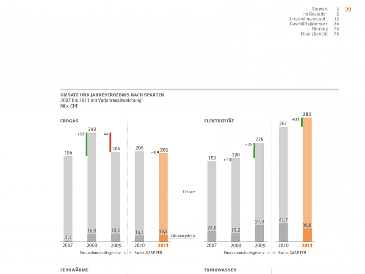
IWB-Swisspower Annual Report 2011 Page 29 Charts are scaled correctly
-
IWB-Swisspower Annual Report 2011 Page 29 Scale for charts, lower right
-
Legal notice
A quantum leap in chart design in the IWB 2009 Annual Report
In 2010, IWB ranks third after Swiss Post and Claro Fair Trade in our rating of known companies that have adhered to the SUCCESS rules of design in their annual report. The following examples are taken from the 2009 report:

-
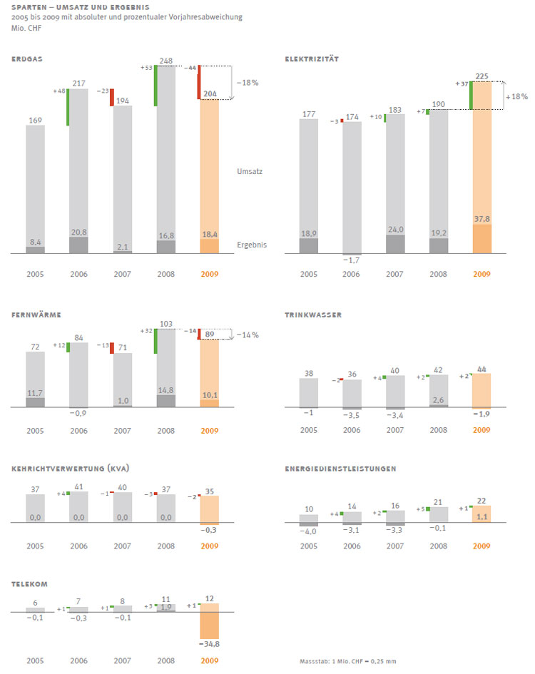
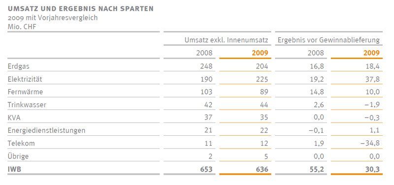
A ray of hope! You rarely come across a clear comparison of seven very different business segments like the one we find here! The level of consistency displayed here should a matter for fact, but this is not the case by far. Just take a quick look at the Lie Charts– split axes and a non-existent scaling concept are actually the norm. One minor thing: the arrangement of the word “Sales” should be up at the top on the level of the column totals – and not next to the upper section – this could lead to misunderstandings. The result is actually part of these sales.... (RH)
-
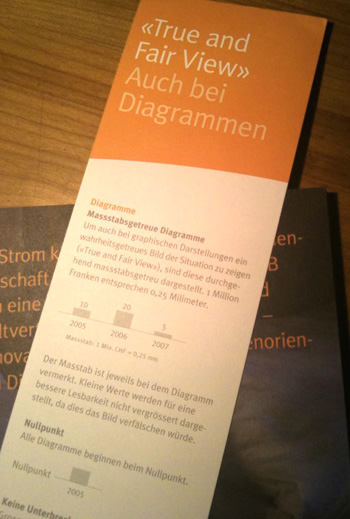
And here the bookmark Both side are printed with the main design rules to help the reader comprehension of the charts better. In my view, this is the first of its kind in the world – and it is not merely some gag, rather it is an extremely helpful idea contributing to greater understanding of the chart and table visualizations in this annual report, which were very good to begin with. (RH)
-
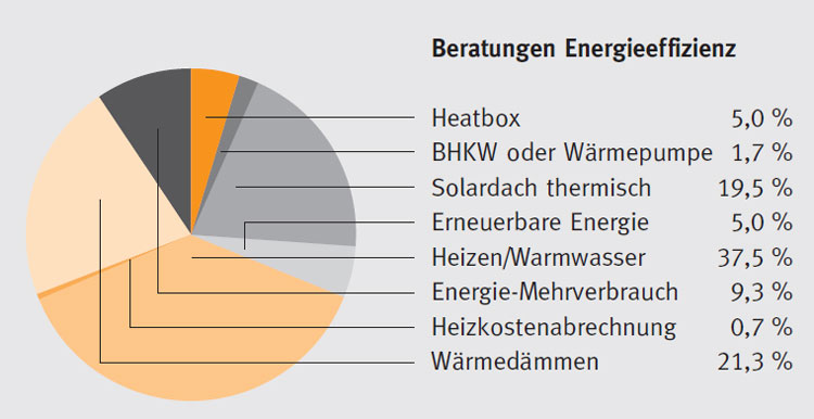
In 2008, pie charts were still used (I) Few visualizations are harder to understand than pie charts with lines connecting the segments to the legend. But things wouldn’t have been much better if the popular legend assignements with colors had been used... (RH)
-
In 2008, pie charts were still used (II) Such visualizations are indeed common, but they belong in the Chart Chamber of Horrors. Why? Because there are simply better ways to visualize these relationships. What is better? There should be at least three dimensions to report something interesting. With fewer dimensions, the message very quickly becomes trivial... (RH)
-
In 2009, bars were introduced This bar visualization already shows two dimensions, which could hardly be displayed with a pie chart. The clear title concept and omission of legends are both very nice. What could be better? Perhaps omitting the percentage values or at least place them together on the lower right (in a table). They are somewhat distracting in this visualization. A rather vivid orange was selected for the figures of the current year – it looks quite nice, but is, in my opinion, not as suitable as our concept of using gray for the previous year and black for the current year. Why? Because orange is reserved for other purposes... (RH)
-
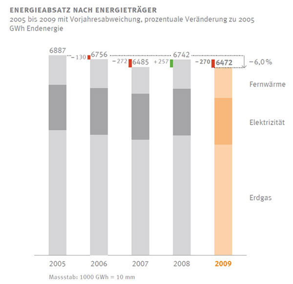
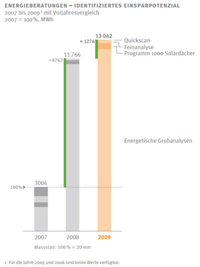
Stacked columns (I) This visualization is also quite good, it has a clear title and is easily understood content. What could have been better? Legends should always be spaced at the same distance tothe columns or bars (here it is somewhat farther to the left). But above all: How does the notation concept for the various axes appear? What distinguishes GWh, CHF, and the number of persons from one another? This should be examined in next year’s annual report... (RH)
-
Stacked columns (II) This visualization is also quite good, but would have been better if the percentage values had appeared differently than GWh in the chart before...
-
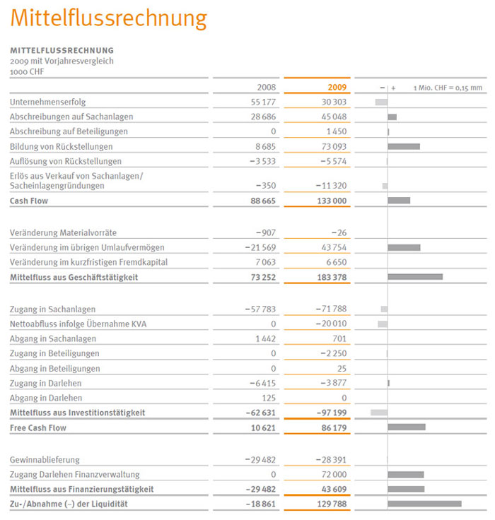
A clear table You rarely find things like they need to be: Time runs -- as in the charts – from left to right, the annoying Sum/Total/Overall has been omitted, and the notation for the columns corresponds to that of the charts... What could have been done better? Numbers to the left and right of the deviation bars would have been helpful. Pushing the two left columns would have quickly created the necessary space for this... In the next newsletter, we will address the far from trivial matter of "Changes" as well as "Incoming and Outgoing," including the whole problem with plus and minus signs in CF calculations. Otherwise, very nice! (RH)
-
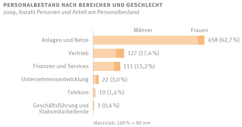
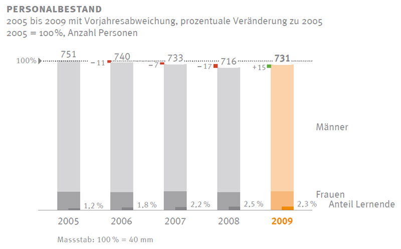
Number of employees A clear chart with one single drawback: It looks just like the column charts above – and this one here pertains, however, to the number of persons on the payroll. One small improvement could be to place the number of men and women perhaps within the column sections – but there seems to have been hardly any change at all. I would not omit a conversion into full-time equivalents if the portion of part-time employees is large and changes over time. (RH)
-
A table without beyond reproach This is also something you rarely come across. All of our recommendations have been followed. Time runs from left to right, no meaningless “Sums” below, a notation concept that applies to both the tables and the charts. My compliments! Clarity could be improved somewhat by slightly reducing the size of the horizontal space – but that was probably a concession to the designer... (RH)
-
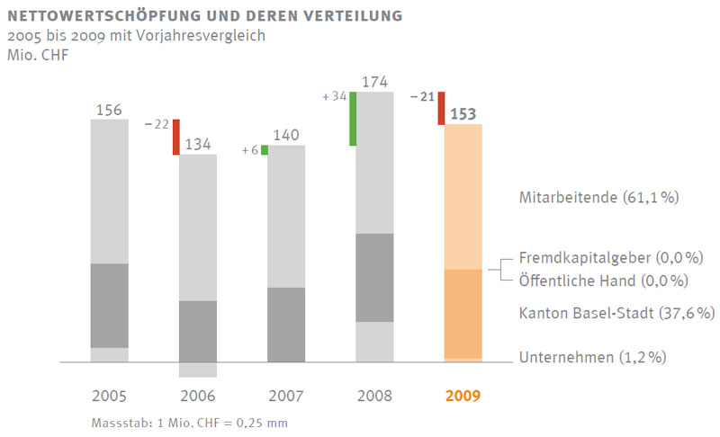
Column chart with deviations from the previous year As pointed out above: Million, CHF, no. of persons, percentage values, and GWh should not look the same – but there should be some improvements in next year’s annual report anyway... It would be easy to label the column sections, but this shouldn’t be used here. (RH)
-
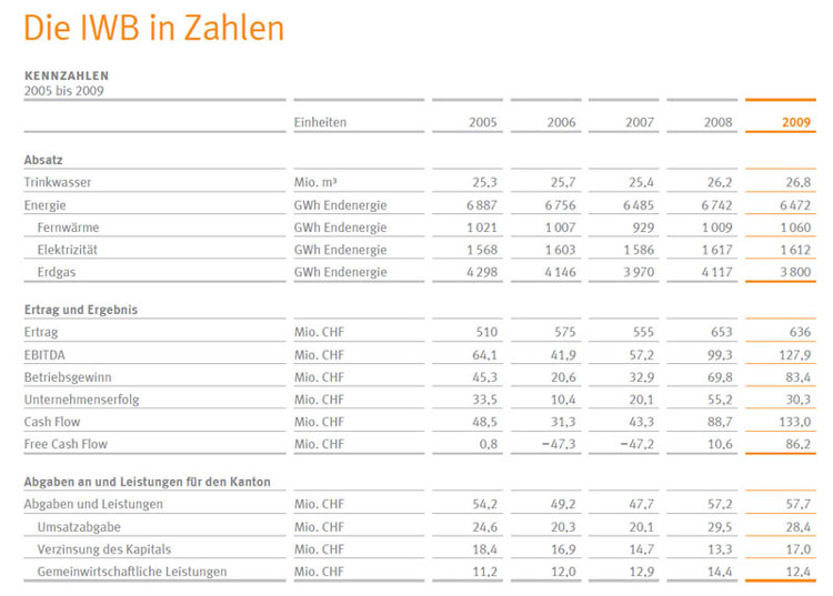
One more table... The layout is very clear; please see the comments above. But I strongly recommend placing all of the sums consistently at the bottom – for example, here by terminal energy. (RH)


