
Raphael Branger
Raphael is co-author of the upcoming book “How to succeed with Agile Business Intelligence”. He works as Principal Consultant Data & Analytics for IT-Logix AG. IT-Logix is a Swiss Business Intelligence, Data Warehouse and Big Data expert.
About
In his position as Principal Consultant Data & Analytics for IT-Logix AG Raphael helps organizations to plan and build what’s needed for their data & analytics requirements. He is a strategist, architect, requirements engineer, agile coach but also a developer. Thereby he provides a holistic view on the projects he is involved with. Besides his project work, Raphael contributes to the community, including IBCS, and shares his knowledge as speaker, author and moderator locally as well as globally. As a member of the Board of Directors and partner he is jointly responsible for the strategic orientation and development of the company IT-Logix, for which he works since 2002.
In addition to the work samples available here, further IBCS® project references in which Raphael Branger has participated can be requested from IT-Logix AG.

IBCS® Certified Consultant
Raphael Branger has successfully completed the IBCS® certification for successful design of reports and presentations at the IBCS Institute in May 2011.
Work samples
Time and deviation analysis with Microsoft SSRS
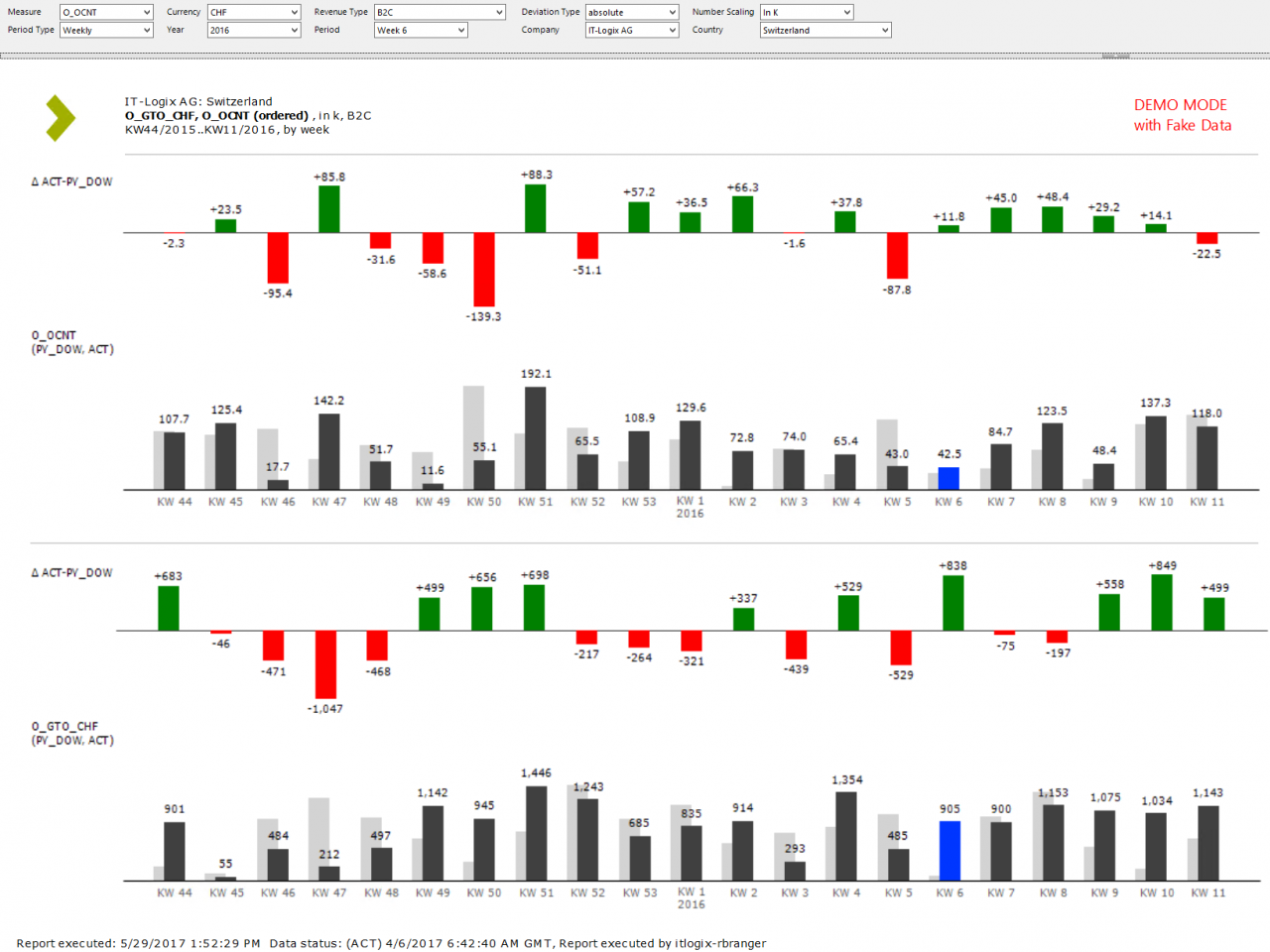
The created information product belongs to the group of parametrized standard reports (BI language), in the context of IBCS® it represents a statistic.
The report is divided into three main areas:
- In the bottom area, a revenue measure is reported showing the scenarios ACT and PY.
- In the middle area a second, user-chosen measure is reported showing again the scenarios ACT and PY.
- In the top area, various parameters are available for the end user to control the report content as well as its layout. The chosen values are displayed in the title area just below the parameter section.
The report was built based on Microsoft SQL Server 2016. For the report itself SQL Server Reporting Services was used. The data foundation is based on SQL Server Analysis Services (Tabular Mode).
-
The report in the standard view The currently selected time period is highlighted in blue.
-
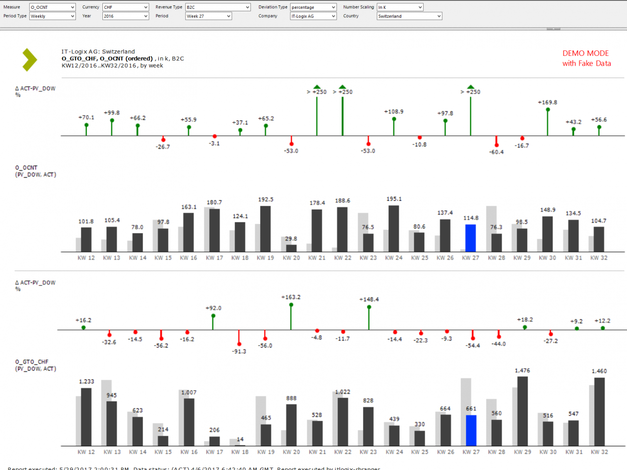
The report with relative variances Relative variances above +250% are displayed as outliers. As only two base scenarios are used, the display of the scenario in the pin header has been omitted.
-
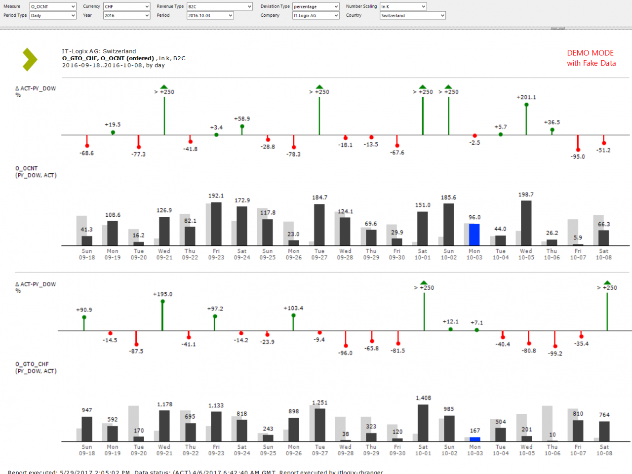
Change of the period type The temporal grouping of the charts can be set to monthly, weekly or daily. The display of different column widths has been omitted for the moment.
-
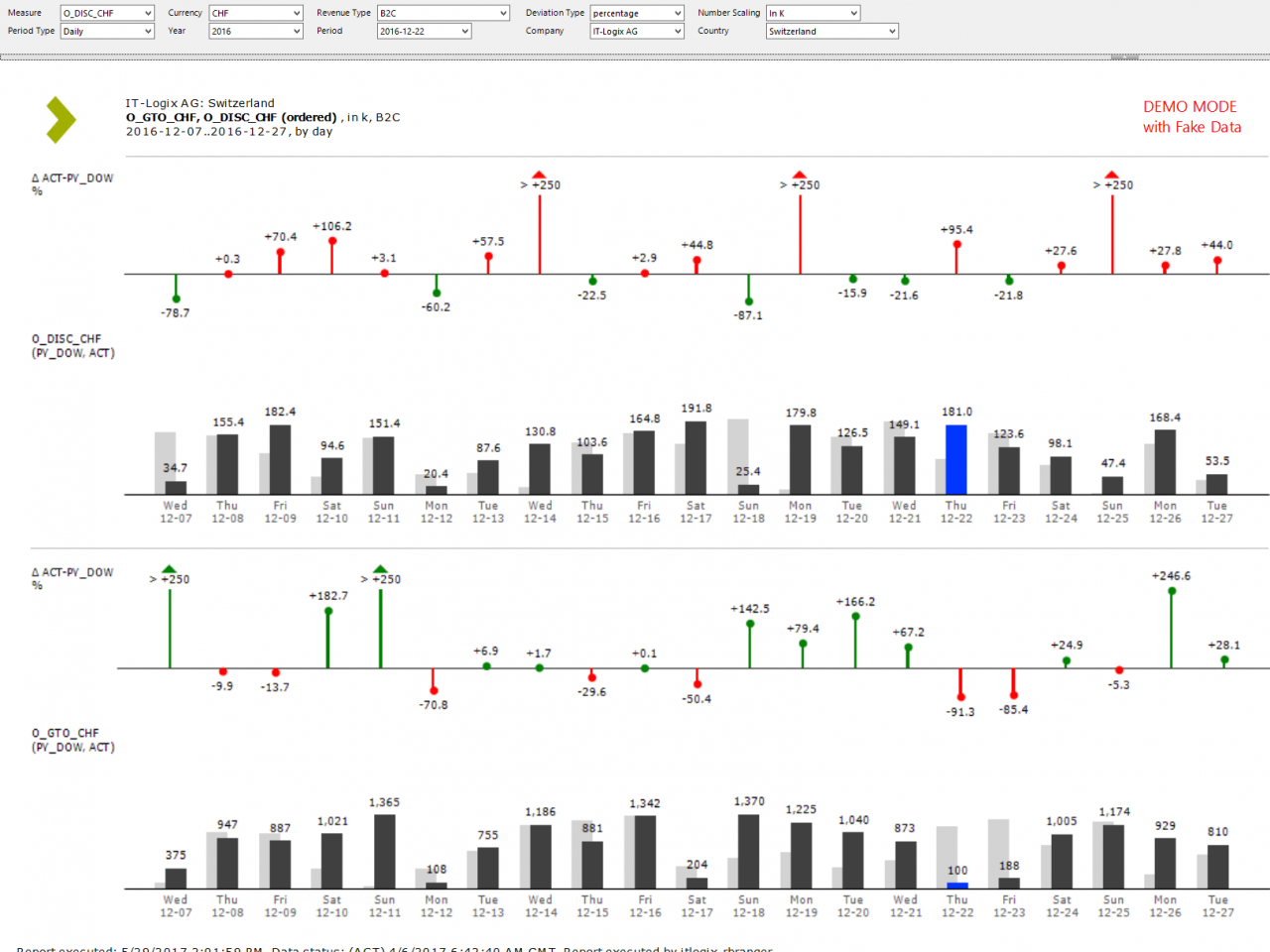
Dynamic selection oft he second measure The logic for the coloring of the upper variance chart is controlled dependent on the business logic of the chosen measure in the upper area. Green is used for desired variances, red for undesired variances. In this example positive variances for discounts are treated as undesired by the business people.
Development and Design of P&L statistics in the Real Estate sector
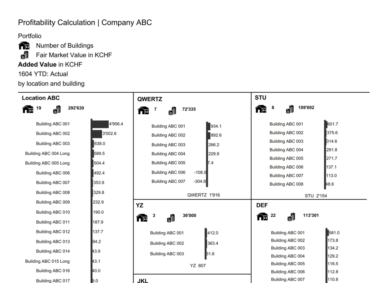
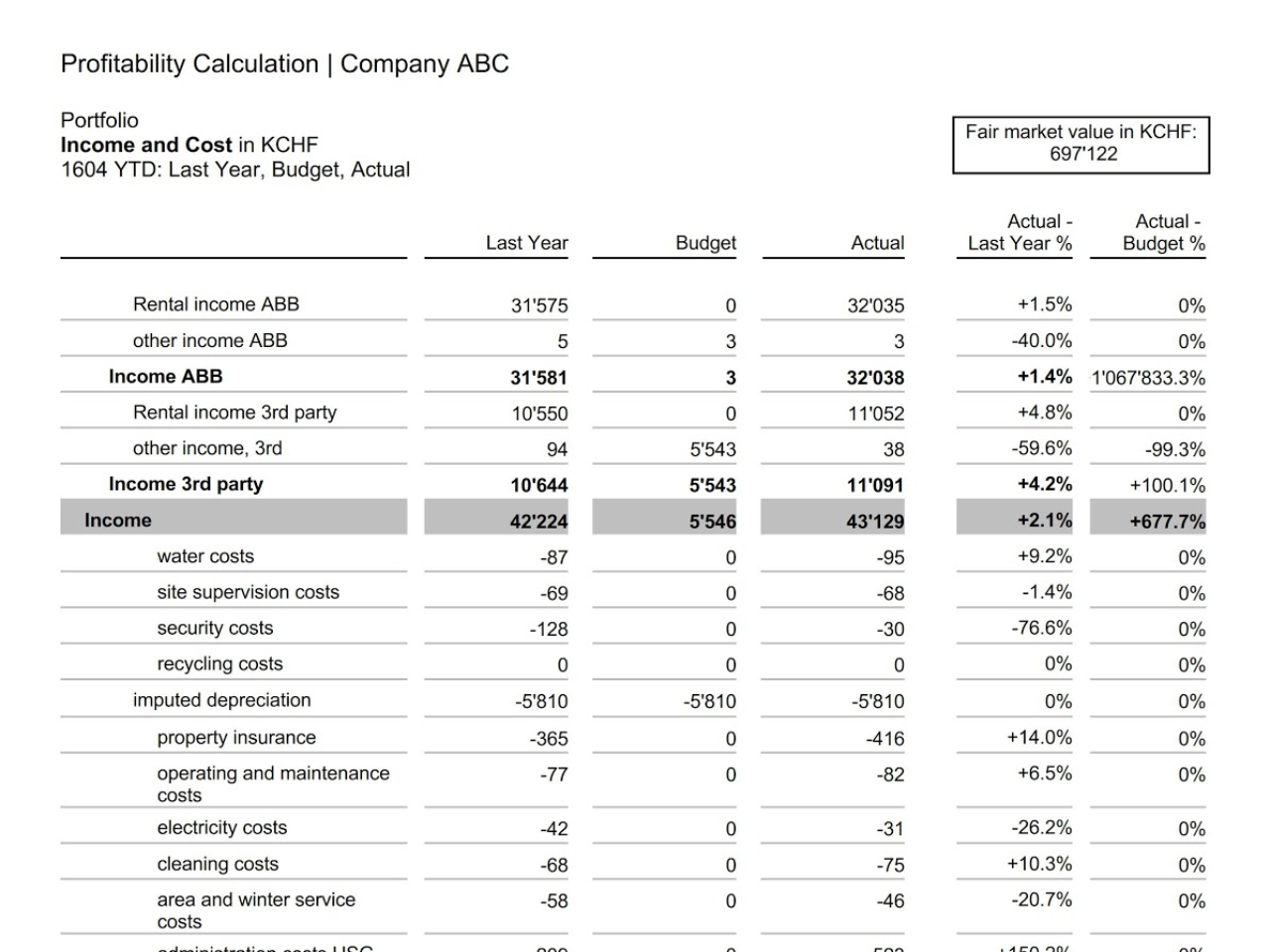
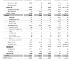
These statistics were designed and developed from the ground up. Initially presented as statistics in mere tabular form by the client, I was able to implement the presentation of the statistics as Small Multiples on the first page during the course of the project. In terms of design we ensured uniform scaling of the tables as well as minimizing redundant labels by replacing them with icons. Data foundation was a SAP BW system, SAP Crystal Reports for Enterprise 4.1 was used as the Frontend Tool.
The following issues couldn’t be omitted due to technical reasons:
- Category width of small multiples: As every small multiple is a separate chart the category width is not perfectly equal.
- Case sensitivity in profit & lost statement: the case sensitivity is not uniform; it was taken 1:1 from the data source.

Redesign of a dashboard using SAP BusinessObjects Web Intelligence 4.1
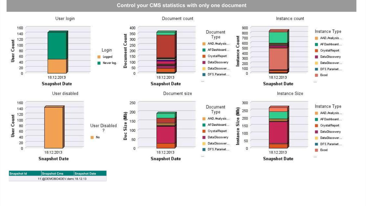
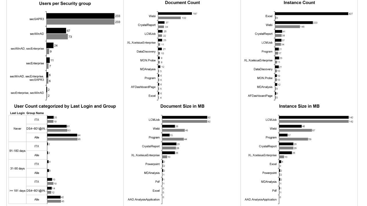
This example deals with the redesign of dashboard containing system usage data of an SAP BusinessObjects system. In the reworked sample another chart type is used. Instead of a 3D column chart 2D bar charts are used. This chart type has the advantage that there is no need for a different color per category. In addition it is much easier to show a comparison value, e.g. of the previous period, in the same chart. In the left column of the dashboard there are mainly changes content-wise in order to omit trivial visualizations of data (as it is the case in the original dashboard).
-
Before ...
-
... and after
Redesign of a statistic using SAP BusinessObjects Web Intelligence XI 3.1
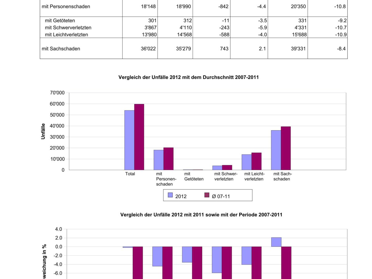
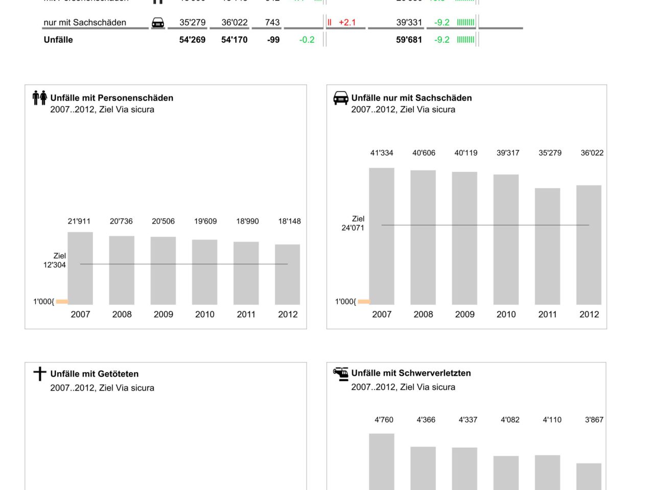
The chosen statistic is part of the Swiss Traffic Accident Statistics, the original document can be found here. This example was created during a study project. The goal was to show to which degree the IBCS® rule set can be applied using SAP BusinessObjects Web Intelligence XI 3.1. Due to plenty of technical restrictions many IBCS® rules couldn’t be applied completely. Still, the example shows well that even with rudimentary technical means you can sometimes massively improve the understandability of a given statistic. The main elements of the redesign are a clear title concept, redesigned tables based on the IBCS® norm as well as the application of the CONDENSE principle. The latter allows the display of a time series in charts instead of average values only. Scaling bars help to point out that two different scales are used.
-
Before ...
-
... and after


