









Tabea Knautz
As Senior Consultant and IBCS® Certified Consultant at Blueforte, Tabea Knautz advises organizations on the strategic direction of their reporting, combining information design with effective corporate performance management.
About
Tabea Knautz advises organizations on how reporting needs to be designed so that executives and business functions can steer and make decisions on a shared information base. As Senior Consultant at Blueforte, she combines information design and reporting structures with a strong understanding of management logic and organizational dynamics.
Her focus is on the strategic design of reporting structures that reduce complexity, provide direction and establish a reliable foundation for decision-making across functions and business areas.
HER APPROACH
Her work starts with a fundamental question: How do people absorb, interpret and use information to make decisions?
Tabea brings together business requirements and management needs with clear information hierarchies and the principles of IBCS. She structures reporting so that relevant variances, interdependencies and areas for action become immediately visible, while information can be interpreted consistently across different levels of decision-making.
A key part of her advisory work is embedding these principles throughout the organization. Shared standards and a clear information logic ensure that reporting creates impact beyond individual reports and business areas and becomes an enduring part of corporate performance management.
HER VIEW ON REPORTING
Visualization influences what executives see, which questions they ask and where discussions are focused.
For Tabea, information design is therefore an integral part of effective corporate performance management. Clear information structures reduce ambiguity, establish a common language for KPIs and business relationships, and focus attention on what matters for management and decision-making.
Her ambition is to shape reporting in a way that turns complex data into a robust basis for decision-making and establishes a shared understanding of numbers and business context across functions and management levels.

IBCS® Certified Consultant
Tabea Knautz is an IBCS® Certified Consultant since December 2021 with extensive experience in the strategic development of standardized reporting structures.
She advises organizations on the application and organization-wide adoption of IBCS principles, aligning standardized data communication with the specific management requirements of the organization.
Work samples
Her work samples demonstrate how information design, business requirements and standardized data communication come together to create reporting structures that provide direction and support effective management.
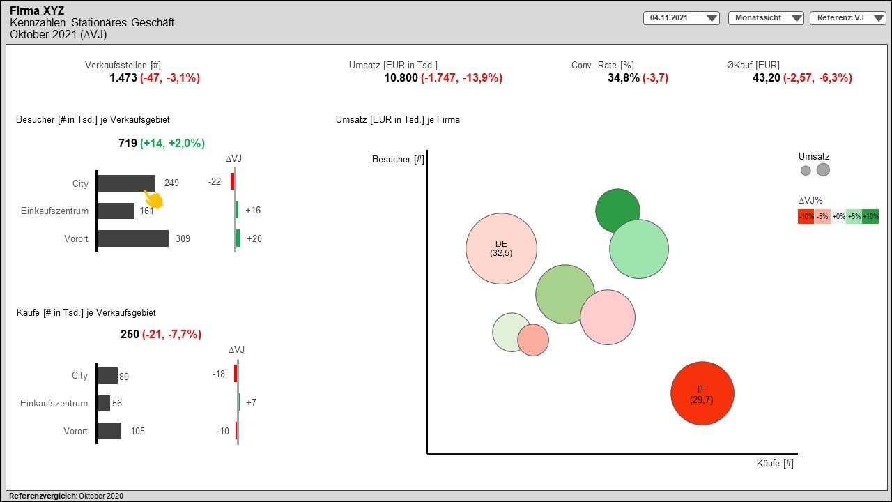
The first work sample shows a dashboard concept that was created for a retail company. The company has stationary and online shops, and this dashboard focuses on stationary retail.
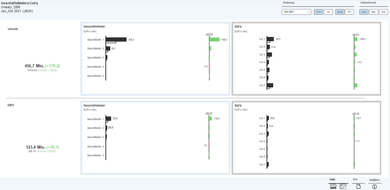
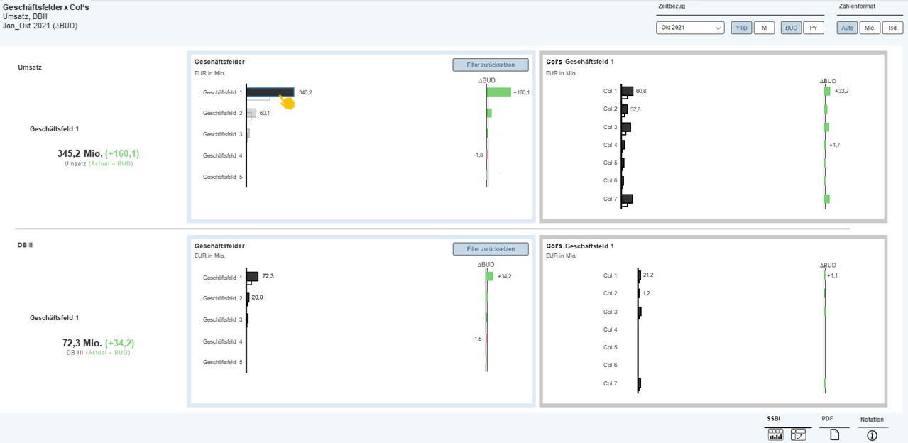
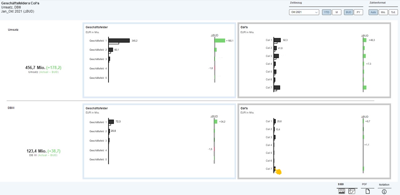
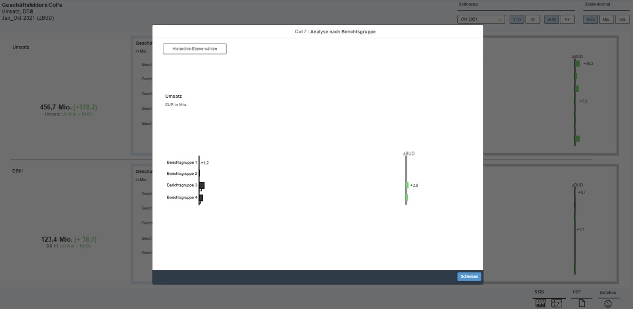
The second work sample was developed using SAP Analytics Cloud (Application Designer) and shows a concept for interactive dashboard design.
-
Work sample 1 - picure 1 Sales per company is the most important information for the report recipient. Various metrics affect sales results, so these are also presented for root cause analysis: Visitors, Purchases, Points of Sale, Conversion Rate (Purchases/Visitors) and ØPurchase (Sales/Purchases). The user can also interactively operate the report and, for example, filter the entire report page by the desired sales area by clicking on the bar chart.
-
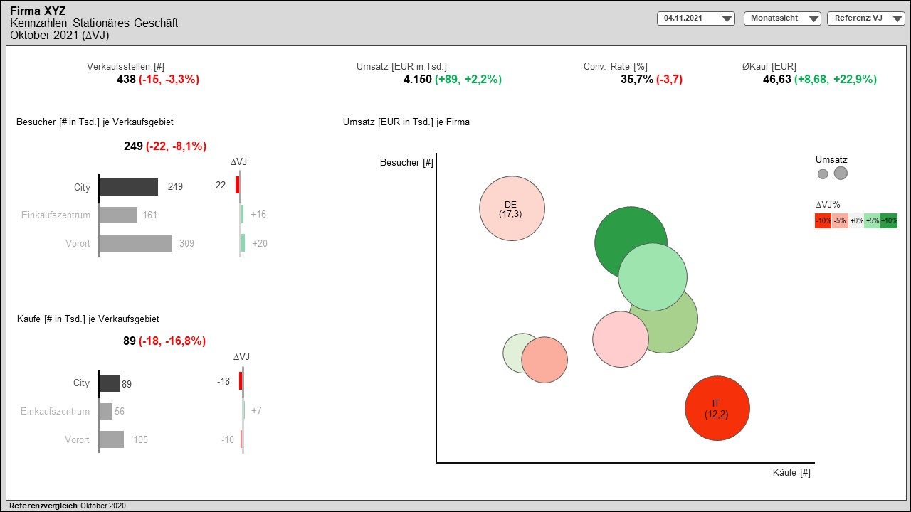
Work sample 1 - picure 2 This view shows an exemplary filtering on the sales area 'City'.
-
Work sample 2 - picure 1 The visual analysis shows revenue and contribution margin by business unit (Geschäftsfelder) and CoI's. In the current view, the data refers to Jan - Oct 2021 and shows a reference comparison to the budget of the same period. The user has several options to interactively control the analysis. In the upper area there are various filters and functions for the time reference and the number format. The charts are also assigned a color notation. A blue frame means that the corresponding diagram can be used as a visual filter. A gray frame means that the user can drill down one analysis level here.
-
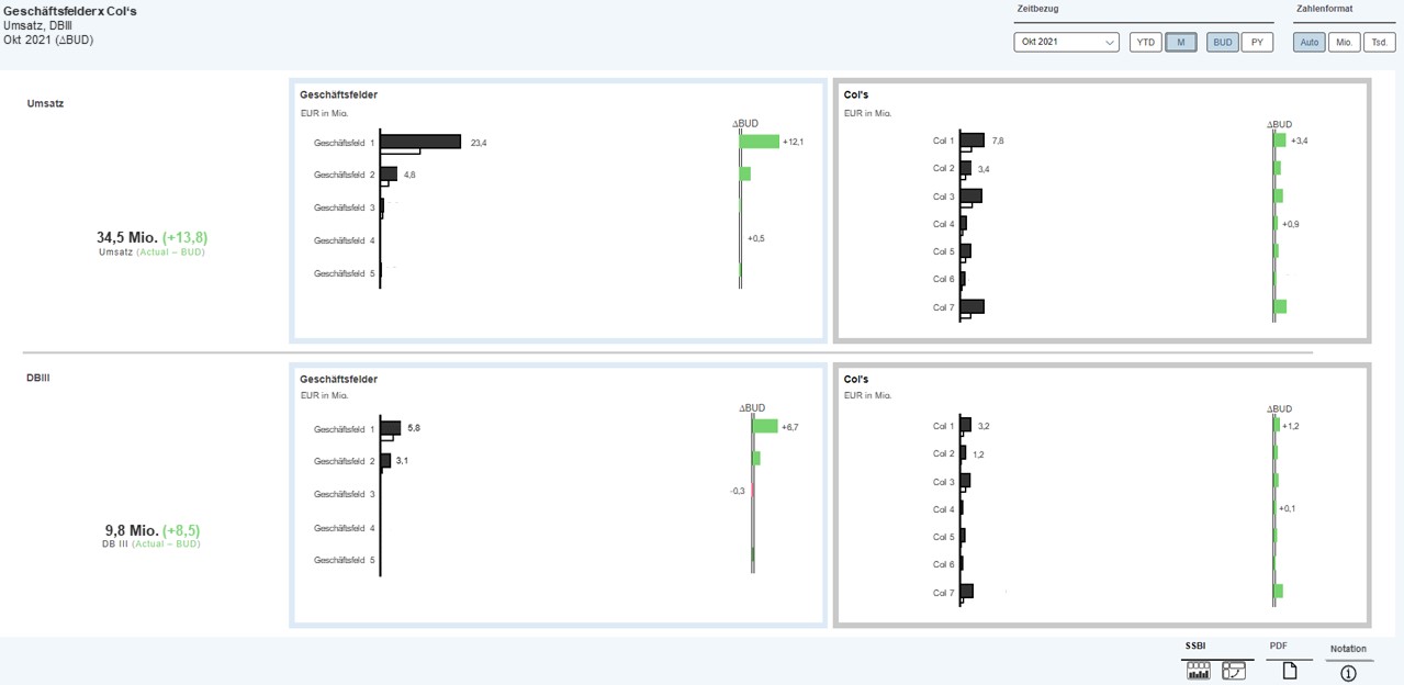
Work sample 2 - picure 2 In this report, the view has been changed from YTD to monthly, so that the data refers only to October 2021 (∆BUD).
-
Work sample 2 - picure 3 A blue frame means that the corresponding chart can be used as a visual filter. In this case, the entire report page has been filtered by Geschäftsfeld 1. Visual filter charts are themselves exempt from filtering, so the filters can be changed at any time.
-
Work sample 2 - picure 4 A gray frame means that the user has the option to drill down one analysis level here.
-
Work sample 2 - picure 5 When drilling to a deeper level, a popup with further analysis options appears.